Imagine losing 70% of potential customers because your Shopify store looks clunky on their phones. That’s the reality for unoptimized stores.
With mobile commerce accounting for 73% of global e-commerce sales by 2025 , ignoring Shopify mobile optimization isn’t just risky,it’s costly.
Google’s shift to mobile-first indexing further raises the stakes, ranking sites based on their mobile performance.
Slow load times, pinching-to-zoom, and confusing navigation aren’t just frustrating for users,they’re red flags for search engines.
But here’s the good news: A well-optimized Shopify store can boost conversions, slash bounce rates, and dominate competitors.
This guide unpacks actionable strategies in the Shopify Mobile Optimization Guide to future-proof your store and maximize mobile conversions.
Key Takeaways
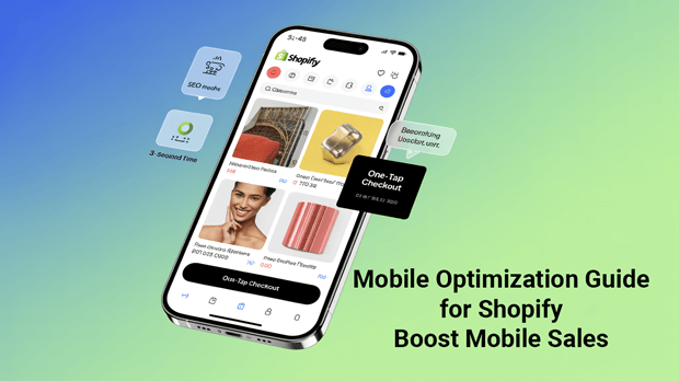
- Speed is King: Mobile pages loading in 3 seconds or less can boost conversion rates by up to 30% .
- Responsive Design Wins: Over 70% of consumers abandon poorly optimized mobile sites .
- SEO Powerhouse: Google prioritizes mobile-first indexing, making optimization critical for rankings .
- Visuals Matter: High-res, compressed product images reduce bounce rates by 40% .
- Simplify Navigation: A sticky menu and one-tap checkout cut cart abandonment by half .
Why Shopify Mobile Optimization Matters
1. Mobile Traffic Dominates Sales
Over 80% of online shoppers use smartphones daily, and 65% make purchases via mobile at least weekly . If your store isn’t optimized, you’re leaving money on the table.
2. Google Rewards Mobile-Friendly Sites
Mobile-first indexing means Google crawls your mobile site before desktop. Poor mobile UX can tank rankings, while fast, responsive designs climb SERPs .
3. Speed Directly Impacts Revenue
A 1-second delay in page load time can slash conversions by 7% . Conversely, optimizing speed enhances user satisfaction and SEO authority.
Shopify Mobile Optimization Best Practices
1. Choose a Responsive Shopify Theme
Responsive themes adapt layouts to screen sizes, ensuring seamless browsing. Shopify’s free themes like Dawn or premium options like Mavon prioritize mobile performance . Test responsiveness using Google’s Mobile-Friendly Tool.
2. Optimize Site Speed
Compress Images: Use tools like TinyPNG to shrink image sizes without sacrificing quality .
Leverage Browser Caching: Enable caching to reduce load times for returning visitors.
Minify Code: Remove unused CSS/JS files via Shopify’s built-in settings or apps like Turbo Speed Booster .
3. Simplify Navigation
Sticky Menus: Keep menus visible as users scroll.
One-Tap Checkout: Reduce steps with Shopify’s deferred checkout or third-party apps like Bold Checkout .
Prominent CTAs: Use bold buttons for “Add to Cart” and “Checkout”.
4. Prioritize Visual Clarity
Mobile-Specific Product Images: Highlight hero images and use carousels for thumbnails .
Readable Fonts: Use sans-serif fonts (16px+) for body text and contrasting colors for headings.
5. Optimize for Local SEO
Mobile users often search locally (e.g. “best shoes near me”). Add location-based keywords, Google My Business listings, and click-to-call buttons.
Recommended Blogs for You:
👉 Shopify Conversion Rate Optimization: Data-Driven Guide
👉 Essential Shopify Apps Guide: Must-Have Tools for Growth
👉 Shopify SEO Strategy: Complete Guide to Ranking Higher
👉 7 Best Shipping Rate Apps for Shopify 2025
👉 How to Set Up Shipping on Shopify: Complete Guide 2025
Boost Mobile Speed: Technical Tips
1. Audit Performance with Core Web Vitals
Google’s Core Web Vitals measure loading speed (LCP), interactivity (FID), and visual stability (CLS). Aim for “Good” scores across all metrics using Shopify’s Speed Report .
2. Limit Redirects
Each redirect adds latency. Use Shopify’s URL redirects sparingly and opt for direct links in campaigns.
3. Lazy Loading
Enable lazy loading for images and videos so content loads only when visible. Shopify’s default settings support this, but apps like Infinite Options enhance functionality .
4. Use a Content Delivery Network (CDN)
Shopify’s CDN automatically caches content globally, speeding up load times for international audiences .
SEO Benefits of Mobile Optimization
Mobile optimization isn’t just about speed,it’s an SEO game-changer. Consider these wins:
Lower Bounce Rates: Fast, intuitive sites keep users engaged, signaling quality to Google .
Higher Organic Rankings: Mobile-optimized sites rank higher for competitive keywords like “buy [product] online.”
Enhanced Social Sharing: Mobile users share 2x more content on social platforms, amplifying backlink potential .
Common Mistakes to Avoid
1. Ignoring Tap Targets: Buttons under 48px frustrate fingers. Use Shopify’s theme editor to resize CTAs .
2. Cluttered Homepages: Prioritize key categories above the fold. Hide secondary links in menus.
3. Uncompressed Media: Large videos or GIFs slow load times. Compress files or use Shopify’s video optimization tools .
Tools to Supercharge Shopify Mobile Optimization
1. Google PageSpeed Insights: Free tool grading speed and offering actionable fixes.
2. Hotjar: Heatmaps reveal how users interact with your mobile site, highlighting friction points.
Your Shopify Mobile Optimization Questions Answered
What is Shopify mobile optimization?
It’s the process of refining your store’s design, speed, and UX for smartphones and tablets, ensuring seamless shopping.
How do I check my Shopify store’s mobile speed?
Use Google PageSpeed Insights or Shopify’s Speed Report. Aim for scores above 90.
Are certain Shopify themes better for mobile?
Yes! Themes like Dawn, Fastor, or Prestige are built for mobile-first performance.
Does mobile optimization affect SEO?
Absolutely. Google penalizes slow, unresponsive sites while rewarding optimized ones with top rankings.
How can I simplify checkout on mobile?
Enable Shopify’s one-page checkout, remove guest checkout barriers, and add Apple/Google Pay.
Conclusion: Future-Proof Your Shopify Store
Mobile optimization isn’t a one-time task,it’s an ongoing strategy. By prioritizing speed, simplicity, and stellar UX, you’ll not only satisfy customers but also dominate SERPs.
Ready to leap ahead of competitors? Start by auditing your site’s mobile performance today.