Have you ever wandered into a store where you couldn’t find what you needed, felt completely lost, and just walked out?
That’s exactly what happens to nearly 94% of shoppers when they encounter poor website navigation – their first impressions are design-related, and confusing site structure is often the top reason they abandon your store.
It’s not just about aesthetics; your Shopify site structure directly impacts whether visitors become customers or bounce faster than you can say “cart abandonment.”
With average Shopify conversion rates hovering between a mere 1.4% and 3.2%, top-performing brands consistently outperform these benchmarks by mastering one critical element most store owners overlook: intentional site architecture.
Key Takeaways:
- The hidden cost of messy navigation: 94% of shoppers form design-based first impressions that make or break their shopping journey (and your revenue)
- Why your menu is secretly your salesperson: Stores with streamlined navigation see up to 3x higher conversion rates than cluttered competitors
- The “Goldilocks zone” for categories: Too few options create decision paralysis, too many cause overwhelm – discover the magic number
- SEO’s best-kept secret: How your URL structure impacts search rankings more than you think (and how to fix it in 20 minutes)
- The mobile trap: 73% of users who struggle with mobile navigation won’t return – but most Shopify themes get this wrong
Why Your Shopify Site Structure Makes or Breaks Your Business
Think of your Shopify store as a physical retail space. Would you design a brick-and-mortar store with products randomly scattered, no signage, and checkout counters buried in the back?
Of course not! Yet that’s exactly what happens when you neglect your site’s information architecture.
When visitors land on your store, they’re silently asking: “Can I find what I need quickly?” and “Do I trust this place enough to buy?”
Clear navigation effectively steers visitors to the right page, boosting both engagement and conversions.
It’s not just about moving from point A to B – it’s about creating a seamless experience that builds confidence at every click.
Consider this: the average Shopify store conversion rate sits between 2-3%, meaning 97-98% of visitors leave without purchasing.
While many factors contribute to this, poorly planned site structure consistently ranks among the top culprits.
High-converting Shopify stores stand out specifically because of their user-friendly navigation, fast loading speed, and mobile optimization.
Recommended Blogs for You:
👉 Wishlist Marketing Strategies for Shopify: Drive Sales and Customer Loyalty
👉 How to Add a Wishlist Button to Your Shopify Store Complete Guide
👉 Pinterest Marketing for Shopify: The Ultimate 2025 Guide
👉 5 Best Shopify Analytics Apps: Complete Comparison Guide
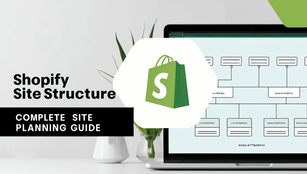
The Anatomy of a High-Converting Shopify Site Structure
Your information architecture (IA) is the blueprint of your store – the invisible framework that organizes content logically. Great IA follows three principles:
1. User-first organization: Structure categories based on how your customers think, not your internal departments
2. Progressive disclosure: Reveal complexity gradually (don’t overwhelm on the homepage)
3. Multiple access paths: Ensure products can be found through search, categories, and recommendations
Most Shopify stores make the fatal mistake of mirroring their inventory system. News flash: your warehouse organization ≠ customer mental models.
Instead, conduct “card sorting” exercises with real customers to discover how they’d naturally group your products.
Navigation Menu Optimization: Your Digital Storefront
Your main navigation is your store’s welcome mat. Here’s what data-driven menus look like in 2025:
- Ideal menu item count: 5-7 top-level items (any more causes decision fatigue)
- Strategic placement: Place your highest-margin categories in positions 2 and 3 (eye-tracking studies show these get most attention)
- Mobile-first design: 73% of users who struggle with mobile navigation won’t return – yet most Shopify themes default to hamburger menus that hide critical options
- Pro tip: Add a “Shop by Need” section alongside traditional categories. For example, a pet store could have “Shop by Pet” (dog/cat/bird) AND “Shop by Solution” (allergy relief, training, travel).
Category Hierarchy Best Practices
Your category structure is where most stores go off the rails. Follow this framework:
Level 1: Broad solution categories
(Examples: “Running Gear,” “Recovery Solutions,” “Outdoor Adventures”)
Level 2: Specific product types
(Examples: “Running Shoes,” “Hydration Packs,” “Trail Running Accessories”)
Level 3: Product-specific filters
(Examples: “Women’s Trail Runners,” “Men’s Road Running Shoes”)
Avoid the “everything but the kitchen sink” approach – Shopify stores with clean hierarchies see up to 40% lower bounce rates.
Remember, your average add-to-cart rate is only 4.6%, so every unnecessary click matters.
SEO-Friendly URL Structure: The Silent Ranking Factor
Your URLs aren’t just addresses – they’re SEO signals Google uses to understand your site. Compare:
- yourstore.com/collections/1234567890
- yourstore.com/collections/running-shoes/womens-trail-runners
Notice the difference? The second URL tells both users and search engines exactly what to expect. Implement these URL best practices:
- Use clear, descriptive words (no numbers or codes)
- Keep it under 60 characters
- Include primary keywords naturally
- Use hyphens between words (never underscores)
- Maintain consistent structure across all pages
Common Shopify Site Structure Mistakes (and How to Fix Them)
Mistake 1: The “Mystery Meat” Navigation
When menu items say things like “Solutions” or “Products” instead of specific categories, you’re forcing users to click blindly. This creates immediate distrust.
Fix: Be ruthlessly specific. Change “Products” to “Women’s Running Shoes” or “Recovery Gear.” If you have subcategories, use mega menus to show them upfront.
Mistake 2: The Never-Ending Scroll
Some stores cram 20+ items into their main navigation, thinking “more options = better.” Reality? It creates paralysis. Users won’t scroll through endless menus – they’ll bounce.
Fix: Implement a “Shop All” dropdown for less critical categories. Keep primary navigation to 5-7 high-value items. Use footer navigation for secondary links.
Mistake 3: Broken Information Pathways
Nothing frustrates users more than clicking “Men’s Shoes” only to find women’s products mixed in, or having no clear way to get back to broader categories.
Fix: Implement breadcrumb navigation (Home > Running > Men’s Shoes) and ensure every product lives in only one primary category. Use Shopify’s collection sorting to maintain consistency.
Step-by-Step Guide to Planning Your Shopify Site Structure
Follow this battle-tested process before touching your theme editor:
Step 1: Map your customer journey
Sketch the path from awareness to purchase for 3 key customer personas. Where do they get stuck? What questions arise at each stage?
Step 2: Audit existing traffic patterns
In Shopify Analytics > Behavior, check:
- Top exit pages (where users leave)
- Landing page performance
- Search terms used on your site
Step 3: Create your category tree
Start broad, then drill down. Ask: “If I only had 5 menu items, what would they be?” Then expand from there.
Step 4: Validate with real users
Use free tools like OptimalSort to have customers organize your categories. You’ll be shocked how differently they think!
Step 5: Implement with intention
Set up collections using Shopify’s manual sorting. Name URLs strategically. Add descriptive collection descriptions that help SEO.
Tools to Audit and Optimize Your Current Structure
Don’t guess – measure. These free and paid tools reveal structural weaknesses:
Google Analytics 4: Check behavior flow reports to see where users drop off. Install the Analyzely app to easily configure Google Analytics 4 on your store and start tracking these insights without needing manual setup.
Hotjar: Watch session recordings to spot navigation struggles
Screaming Frog: Crawl your site to find broken links and thin content
Shopify’s Built-in Search Analytics: See what customers are searching for (and not finding).
Pro tip: Run a “5-second test” – show your homepage to someone for 5 seconds, then ask what the store sells. If they can’t answer immediately, your structure needs work.
FAQ: Shopify Site Structure Essentials
How many menu items should a Shopify store have?
Research shows 5-7 top-level items is the sweet spot. Any more causes decision fatigue – 73% of users who struggle with navigation won’t return, especially on mobile. Prioritize your highest-converting categories and tuck others into dropdowns.
Does Shopify automatically generate SEO-friendly URLs?
No – Shopify defaults to messy numeric URLs unless you customize them.
Always edit your collection and product URLs to include descriptive keywords.
This simple fix can boost organic visibility by up to 30% according to Moz’s latest crawl data.
How do I fix a confusing category structure without hurting SEO?
Use 301 redirects for any changed URLs, maintain internal linking, and update your sitemap.
The temporary traffic dip is worth it – stores that restructure properly see 15-20% higher engagement within 60 days.
Remember, clear navigation boosts both user experience and search rankings.
Should I use mega menus on my Shopify store?
Absolutely for desktop – but only if done right. Mega menus should show 2-3 category levels with visuals, not just text lists.
On mobile, use accordion menus instead of hamburger icons (they increase engagement by 27% according to Baymard Institute).
How often should I review my site structure?
Quarterly for most stores. Check your Shopify search analytics monthly – if you see recurring “not found” terms, it’s time to adjust your structure.
Top-performing brands treat site architecture as living, evolving system, not a one-time setup.
Final Thoughts: Your Site Structure Is Your Silent Sales Team
Your Shopify site structure isn’t just a technical detail – it’s the invisible salesperson guiding every visitor toward (or away from) your checkout.
While flashy product pages get attention, it’s the underlying architecture that determines whether those visitors actually convert.
Remember that 94% statistic? That’s not just a number – it represents real revenue walking out your digital door every single day.
The stores winning in 2024 aren’t necessarily the ones with the best products or lowest prices; they’re the ones who’ve mastered the art of frictionless navigation.
Start small: pick one section of your store (maybe your main menu or category hierarchy) and apply these principles this week. Measure the impact on bounce rates and time-on-page.
You’ll likely see improvements within days – because when you make it effortless for customers to find what they need, they’ll reward you with their wallets.