Urgency is one of the most powerful levers in ecommerce. When used correctly, it nudges a hesitant browser to become a confident buyer. However, there is a fine line between a “limited-time offer” and a store that feels like a digital shouting match.
For Shopify merchants, the challenge is implementing these psychological triggers in a way that aligns with modern UX standards. In this guide, we’ll explore how to architect urgency that feels like a service to the customer, not a trap.
Summary
- The Goal: Learn to implement high-converting urgency tactics that respect your customer’s browsing experience.
- Who It’s For: Shopify merchants looking to increase Conversion Rate (CR) and Average Order Value (AOV) without aggressive “hard-sell” tactics.
- Key Insight: True urgency is driven by relevance and timing—using tools like targeted announcement bars and behavioral popups—rather than generic countdowns on every page.
- The Outcome: A store that feels professional, builds trust, and moves visitors to action naturally.
To create urgency on Shopify without overwhelming visitors, use targeted behavioral triggers. Instead of store-wide alerts, deploy countdown timers and low-stock notices only to interested users via page-specific announcement bars and exit-intent popups to ensure relevance without friction.
What Problem Are Shopify Merchants Actually Facing Here?
The “Urgency Paradox” is real. Merchants know they need to drive action, but the modern consumer is “urgency-blind.”
Years of seeing fake “3 people are looking at this item” notifications and permanent “sale ends in 10 minutes” timers have made shoppers skeptical.
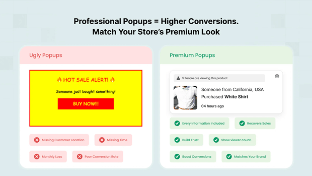
When a Shopify store is cluttered with flashing banners and intrusive popups, the result isn’t more sales—it’s high bounce rates and brand erosion.
Merchants often struggle to find the “sweet spot” where they can communicate a deadline or scarcity without making the storefront feel “scammy” or desperate.
Why This Problem Happens (Root Causes Explained Clearly)
The root of the problem usually lies in Static Implementation. Most stores set an urgency tactic (like a countdown timer) and leave it running for every visitor, on every device, at all times.
- Lack of Segmentation: Showing a “First Purchase Discount” to a returning VIP customer is irrelevant and annoying.
- Device Friction: A popup that looks great on desktop might cover 90% of a mobile screen, leading to immediate exits.
- Poor Timing: Triggering a “Buy Now” alert the second a user lands on the homepage is premature; they haven’t even seen the product value yet.
Recommended blogs for You:
👉 Personalized Popups: 5 Strategies to Target Customer Segments
👉 Abandoned Browse Recovery: How to Catch Shoppers Before They Leave
👉 Popups vs Announcement Bars: When to Use Each on Shopify
👉 How to localize Shopify free shipping bar by country
How This Problem Hurts Shopify Conversion Rates and Revenue
According to data from the Baymard Institute, approximately 69% of all ecommerce visitors abandon their carts. While some of this is natural browsing behavior, a significant portion is due to “friction”—often caused by overwhelming UX elements.
When urgency is mismanaged:
- Trust Drops: If a visitor sees a “Sale ends in 2 hours” timer on Monday, and the same timer on Tuesday, they lose trust in your pricing.
- Conversion Fatigue: Constant alerts cause “cognitive load,” making it harder for the user to focus on the product benefits, ultimately leading them to close the tab.
- Revenue Loss: High-intent customers might leave simply because the mobile checkout experience was blocked by a poorly timed announcement bar.
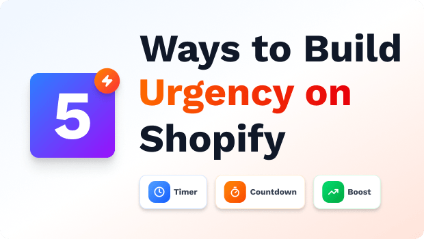
Step-by-Step Solution: How To Fix This Problem in Your Store
1. Use Real-Time Social Proof to Create “Soft Urgency”
Instead of generic “X people are viewing this” claims, use verified social proof tied to your actual store data: Display recent purchase notifications (e.g., “Alex in Berlin just bought this 8 minutes ago”) on high-intent product pages.
Show live stock + view counters only on products that already have meaningful traffic and sales
2. Create Urgency by Removing Fit Uncertainty (Especially for Fashion)
For fashion and apparel brands, the biggest blocker to buying isn’t price or even shipping—it’s uncertainty: “Will this actually look good on me?” When you remove that risk, shoppers move much faster from browsing to checkout.
Tools like GenLook Virtual Try On let customers virtually try on your products using their own photos, directly on the product page. Here’s how this translates into urgency that feels helpful, not pushy:
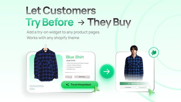
- Shoppers can see themselves in the product, which reduces the mental “I’ll think about it later” loop.
- You can pair try-on with subtle microcopy like “Try it on now while your size is still in stock,” combining real-time visualization with honest scarcity.
- Because Genlook can capture emails during the try-on flow, you can follow up with time-limited offers (“24 hours to claim 10% off what you tried on”) that are highly relevant to that shopper’s actual preferences.
3. Implement “Invisible” Urgency Through Targeting
Instead of a store-wide blast, use Page Targeting. For example, only show a countdown timer for a specific flash sale on the relevant Collection Page or Product Detail Page (PDP).
4. Use Behavioral Triggers to Respect the “Flow”
Instead of showing a discount popup immediately, wait for a Scroll Depth trigger (e.g., 50% of the page) or an Inactivity trigger. This ensures the visitor is actually engaged with your content before you interrupt them with an offer.
5. Leverage “Evergreen” Scarcity
Personalized urgency is often more effective than global urgency. Use Evergreen Timers that start specifically when a visitor enters your site or adds an item to their cart. This feels like a personal window of opportunity rather than a fake site-wide deadline.
Tools, Frameworks & Templates That Make This Easier
For Shopify merchants, the right tech stack can automate this balance. A tool like SalesPulse – Sales Pop Up allows for this level of granularity without needing a developer.
- Smart Announcement Bars: You can use one of their 14 pre-built templates—like the “Minimal Elegant” or “VIP Exclusive”—to match your brand aesthetic. More importantly, these bars support Geo-targeting and Customer Segmentation. This means you can show a “Free Shipping to New York” bar only to visitors in the USA, keeping the message highly relevant.
- Intelligent Popups: Rather than annoying every visitor, you can set up Exit-Intent popups. These only appear when the system detects a mouse moving toward the “close tab” button, recovering up to 15% of abandoning visitors by offering a last-minute incentive at the exact moment they were about to leave.
Common Shopify Mistakes That Make This Problem Worse
- Stacking Bars and Popups: Having two announcement bars at the top, a sticky chat widget, and a center modal popup all active at once.
- Vague Deadlines: Saying “Sale Ending Soon” is less effective than a specific, localized countdown timer that provides a clear “why” for the urgency.
- Ignoring Mobile UX: Failing to use “Slide-in” styles for mobile, which are less intrusive than full-screen modals.
Smarter Alternatives When the Standard Fix Doesn’t Work
If a countdown timer feels too aggressive for your high-end brand, try Progressive Urgency:
- Free Shipping Threshold Bars: Instead of a deadline, show a bar that updates in real-time as the customer adds items to their cart (e.g., “Only $15 away from Free Shipping”). This creates “positive urgency” by encouraging a higher AOV to reach a benefit.
- Inventory Alerts: Use subtle text near the “Add to Cart” button like “Only 3 left in stock” to leverage real-time scarcity without a ticking clock.
What To Do Next in Your Shopify Optimization Journey
- Audit Your Current Alerts: Go through your store on a mobile device. Are any popups or bars overlapping or difficult to close?
- Set Up One Segmented Campaign: Use a tool like SalesPulse ‑ Sales Pop Up to create an announcement bar specifically for “Returning Customers” with a “Welcome Back” discount.
- A/B Test Your Copy: Don’t guess which urgency works. Test a “10% Off” discount against “Free Shipping” to see what your specific audience values more.
Frequently Asked Questions
How do I add a countdown timer to Shopify?
You can add a countdown timer using a Shopify app like GroPulse. These apps allow you to place timers in announcement bars or popups, with options for fixed, recurring, or evergreen settings to match your sale type.
Are popups bad for SEO?
If popups are intrusive on mobile or cover the main content immediately, they can hurt your “Core Web Vitals.” To avoid this, use “Slide-in” styles or delay triggers so the popup appears only after the user has engaged with the page.
What is the best way to reduce cart abandonment on Shopify?
The most effective way is using Exit-Intent triggers. By offering a time-sensitive discount or a free shipping code exactly when a user intends to leave the checkout or cart page, you can recover a significant percentage of lost sales.
Conclusion
Urgency is a tool, not a strategy. When implemented with the “visitor-first” mindset, using smart targeting, behavioral triggers, and clean design, it becomes a powerful engine for Shopify growth.
Start small, test often, and always prioritize the user’s journey over the quick click.