If you walk into a physical retail store, the first sign you see usually sets the tone for your visit. Is there a sale? Is there a new arrival?
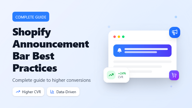
On Shopify, your announcement bar (or “sticky header”) serves this exact purpose. It occupies the most valuable real estate on your website: the top 30-50 pixels.
However, many merchants treat this space as an afterthought. They type “Free Shipping Over $50,” pick a background color, and forget about it. This is a wasted opportunity. In 2025, with customer acquisition costs rising, every pixel must work harder.
The modern announcement bar isn’t static; it’s an intelligent layer of your funnel that can handle geolocation, countdowns, and A/B testing.
Key Takeaways
- The Shift: In 2025, announcement bars are no longer just for “Free Shipping” text; they are dynamic, personalized conversion tools.
- The Strategy: Success relies on “Micro-Segmentation”—showing different messages to visitors based on location, device, and source.
- The Tech: Performance is critical. Poorly coded bars cause Cumulative Layout Shift (CLS), hurting your SEO scores.
- The Outcome: When optimized for mobile and urgency (via countdowns), these bars can recover sales without the intrusion of a full-screen popup.
What makes an effective announcement bar?
An effective Shopify announcement bar combines high contrast design with low-friction copy. It must load asynchronously (to prevent SEO penalties), offer a clear close button for mobile users, and use dynamic targeting (e.g., displaying “Free Shipping to [Country]”) to increase relevance.
Design & UX: Avoiding the “Banner Blindness” Trap
“Banner blindness” occurs when visitors subconsciously ignore elements that look like ads. If your announcement bar blends too perfectly into your theme, it becomes invisible. If it’s too aggressive, it becomes an annoyance.
Contrast is King
Your bar needs to pop, but it shouldn’t scream.
- Best Practice: Use a background color that contrasts with your navigation menu but complements your brand palette. If your header is white, a black or deep accent-colored bar draws the eye immediately.
- Texture: avoid complex gradients or background images in the bar; they reduce text readability, especially on mobile devices.
Animation: Subtle vs. Distracting
Movement catches the eye, but too much movement kills trust.
- Do: Use a subtle slide-in or fade effect if you have multiple messages (e.g., rotating between “Free Shipping” and “New Returns Policy”).
- Don’t: Use rapid blinking or scrolling “ticker tape” text. It feels dated and cheapens the brand perception.
The Art of Microcopy: Writing for Small Screens
You have roughly 40-60 characters before your message gets truncated on a mobile screen. Every word costs money.
Be Specific, Not Generic
Ambiguity creates friction.
- Bad: “Sale on now.”
- Good: “Summer Sale: 30% Off Swimwear.”
Use “Dynamic Math” in Your Copy
If you are using App like Gp Free Shipping Bar or similar advanced bar apps, you can often configure progressive messaging.
- Stage 1: “Free Shipping on orders over $100.”
- Stage 2 (Item added to cart): “You are only $15 away from Free Shipping!”
This gamification encourages Average Order Value (AOV) growth without the user ever leaving the page.
Targeting Strategies: The End of “One Size Fits All”
This is the biggest differentiator between a standard Shopify theme bar and a professional tool. In 2025, showing the same message to a visitor in New York and a visitor in London is a mistake.
Geo-Targeting
Shipping logistics vary by region. Your bar should reflect that.
- Scenario: You offer free shipping to the US, but flat-rate shipping to the UK.
- Strategy: Use geo-targeting to display “Free US Shipping” only to IP addresses in the United States. For UK visitors, switch the message to “Fast Delivery to the UK via DHL.”
- Implementation: Tools like SalesPulse use country codes to detect location on the client side, ensuring the right message hits the right user instantly.
Source-Based Targeting
Where did the visitor come from?
- Traffic Source: If a user clicks an Instagram Ad for a specific shoe, the announcement bar can reinforce the discount code mentioned in that ad (e.g., “Welcome Insta Fam! Use code IG20 at checkout”).
Using Urgency Without Being Spammy (Countdown Timers)
Urgency is a potent psychological trigger, but fake urgency destroys trust.
The Three Types of Timers
- Fixed Timers: Great for real holidays (e.g., “Black Friday Ends in 4 Hours”). Everyone sees the same end time.
- Recurring Timers: Good for shipping cut-offs (e.g., “Order in the next 2 hours for Same-Day Dispatch”). This is highly effective for reducing cart abandonment.
- Evergreen Timers: These are unique to the user (e.g., “Your 10% discount expires in 15 minutes”).
Pro Tip: If you use a countdown timer, ensure what happens when it hits zero is realistic. If the timer resets immediately, customers will notice. It is better to have the bar disappear or change the message to “Offer Expired” to maintain integrity.
Mobile Optimization & SEO Performance
This is the technical side that breaks many stores. Google focuses heavily on Core Web Vitals, specifically Cumulative Layout Shift (CLS).
The CLS Problem
If your announcement bar loads after the rest of your page, it “pushes” the navigation down by 30-50 pixels. This visual jolt is penalized by Google.
- The Fix: Use apps that utilize deferred script loading or reserve space in the CSS before the content loads.
- SalesPulse Architecture: For example, SalesPulse uses a specific loading order (CSS first, then functionality) to minimize DOM manipulation and prevent the layout from jumping around, which is crucial for maintaining green SEO scores.
The “Thumb Zone” Rule
On mobile, the top of the screen is hard to reach with a thumb.
- Make it clickable: The entire bar should be a link, not just a tiny “Click Here” button.
- The “X” Button: You must allow mobile users to close the bar. If it covers their cart icon or menu and they can’t remove it, they will bounce.
Measuring Success: Metrics That Actually Matter
Don’t just set it and forget it. You need to know if the bar is driving revenue.
Click-Through Rate (CTR)
A healthy announcement bar CTR varies by industry, but typically falls between 3% and 8%. If you are below 1%, your offer isn’t compelling, or your color contrast is too low.
A/B Testing
Never guess what works. Run split tests on:
- Background Color: Red vs. Black?
- The Offer: “% Off” vs. “$ Off”?
- The Copy: “Free Shipping” vs. “We Pay For Shipping”?
Look for tools that offer built-in A/B testing to automatically serve the winning variant to the majority of your traffic.
Recommended Blogs for You:
👉 Abandoned Browse Recovery: How to Catch Shoppers Before They Leave
👉 A/B Test Popups: The Complete Shopify Merchant Guide
👉 The Ultimate Seasonal Popup Strategy for Shopify Conversion Rate Optimization (CRO)
👉 Popups vs Announcement Bars: When to Use Each on Shopify
Frequently Asked Questions
Can I have multiple announcement bars on Shopify?
Yes, many merchants use “rotators” or sliders to show multiple messages. However, ensure the rotation speed allows enough time to read (minimum 4-5 seconds per slide). Alternatively, you can stack bars, but this consumes too much screen space on mobile.
Will an announcement bar slow down my site?
It depends on how it’s built. Bars built directly into modern OS 2.0 themes are fast. If you use an app, look for one that uses “Deferred loading” and modular JavaScript (like SalesPulse) to ensure it doesn’t block the main thread of your website.
Should the bar be sticky (always visible)?
Generally, yes. A sticky bar ensures the offer (and the CTA) is always accessible, even when the user scrolls down to read product reviews. However, ensure it doesn’t overlap with other sticky elements like your chat widget or navigation menu.
What is the best height for an announcement bar?
Keep it slim. 30px to 50px is the industry standard. Anything larger than 60px starts to feel like a banner ad and pushes your product images too far down the page (below the fold).
