Free shipping is the ultimate psychological trigger in ecommerce. According to recent industry data from the Baymard Institute, “extra costs” (like shipping) are the #1 reason for cart abandonment during checkout.
For Shopify merchants, the “Free Shipping Bar” has become a staple tool to combat this, yet many stores fail to see a significant lift in their Average Order Value (AOV).
The reality is that a poorly configured shipping bar can actually create friction rather than resolve it.
Whether it’s a threshold that’s too high or a design that blends into the background, these micro-errors add up to major revenue leaks.
Summary
- The Goal: Increase Average Order Value (AOV) by avoiding common UX and strategy pitfalls.
- Who It’s For: Shopify merchants looking to optimize their shipping incentives.
- Key Takeaway: A “set it and forget it” approach leads to missed revenue; dynamic, geo-targeted bars are essential.
- The Solution: Use strategic placements like product pages and cart drawers to keep the incentive visible.
The biggest mistakes with Shopify free shipping bars include setting a threshold too far above your AOV, failing to use dynamic messaging (e.g., “{remaining} away”), ignoring mobile responsiveness, and only displaying the bar on the homepage instead of the product or cart pages.
What Problem Are Shopify Merchants Actually Facing Here?
Most merchants install a shipping bar app and assume the work is done. However, they soon face “Incentive Blindness.” This happens when a customer sees the free shipping offer once on the homepage but forgets about it by the time they reach the product page or cart drawer.
If the progress isn’t updated in real-time as they add items, the “nudge” to spend more disappears. This lack of continuity is a silent conversion killer.
How These Mistakes Hurt Shopify Conversion Rates and Revenue
When a shipping bar isn’t optimized, it fails to perform its primary job: gamifying the shopping experience.
- Cart Abandonment: If a customer only discovers the shipping cost at the final checkout step, they are likely to bounce.
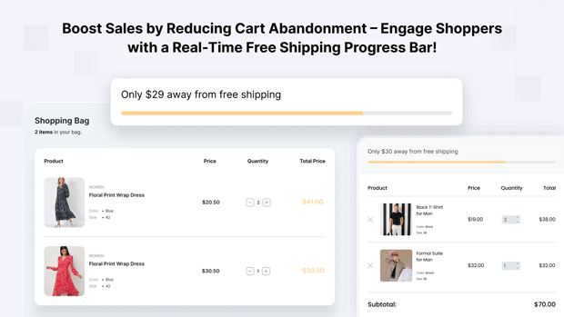
- Stagnant AOV: Without a visual progress bar showing exactly how close they are to the goal (e.g., “Only $15 away!”), customers have no immediate reason to add “just one more item.
- Poor UX: A bar that covers your navigation menu on mobile or uses clashing colors creates a “cheap” brand feel that erodes trust.
Recommended Blogs for You:
👉 Shopify Free Shipping Threshold Strategy
👉 How to Schedule Shopify Free Shipping Bars for the Holidays
👉 How to localize Shopify free shipping bar by country
👉 5 Smart Ways to Build Urgency on Shopify
Step-by-Step Solution: How To Fix These Problems in Your Store
1. Set a “Goldilocks” Threshold Don’t pick a random number. A common mistake is setting a $100 threshold when your AOV is $30. The jump is too high.
- The Fix: Set your threshold roughly 10-20% above your current AOV. If your average order is $40, set free shipping at $50 to encourage that one extra small purchase.
2. Use Dynamic, Variable-Based Messaging A static message like “Free Shipping Over $50” is informative but not persuasive.
- The Fix: Use dynamic variables like {remaining} to show real-time progress. Messages like “Only {remaining} away from free shipping!” create a sense of progress that customers want to complete.
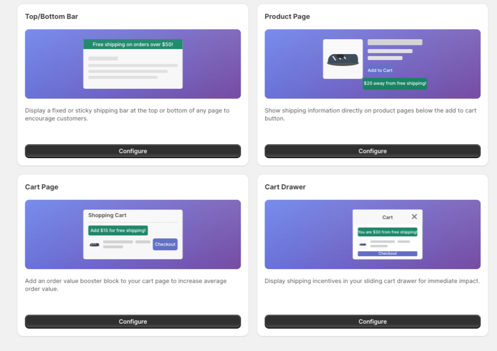
3. Implement Multi-Placement Visibility Stop relying solely on a top-header bar.
- The Fix: Use a multi-placement strategy. High-growth brands often use a Product Page Bar (placed near the ‘Add to Cart’ button) and a Cart Drawer Bar to ensure the incentive is always visible during the decision-making process.
Tools That Make This Workflow Easier
To implement these fixes without needing a developer, many Shopify merchants use the GroPulse Free Shipping Bar.
It addresses these common mistakes by offering:
- Geo-Targeting: Automatically show different thresholds for different countries, ensuring your international customers see relevant offers.
- Growth Plan Features: Unlock advanced placements like the Cart Drawer Bar and Product Page Bar, which are critical for maintaining visibility throughout the funnel.
- Countdown Timers: Adds a layer of urgency to your shipping offers during flash sales or holiday periods.
Common Shopify Mistakes That Make This Problem Worse
- Ignoring the Mobile Experience: Many bars are too tall for mobile screens, pushing the actual product content “below the fold.” Always test your bar’s height and font size on mobile views.
- Poor Color Contrast: If your bar background is white and your site background is white, it disappears. Using a “Success Background Color” (like a soft green) when the goal is met provides a positive psychological reward.
- Mismatched Shipping Settings: Ensure your app’s threshold matches your actual Shopify Shipping settings. There is nothing more frustrating for a customer than being told they earned free shipping by a bar, only to see a shipping charge at checkout.
Frequently Asked Questions
How do I increase AOV with a free shipping bar?
Set your free shipping threshold 10-15% above your current Average Order Value and use dynamic progress messages to show customers exactly how much more they need to spend.
Should I put my shipping bar at the top or bottom?
The top is more traditional and visible, but the bottom is often less intrusive on mobile devices. Test both to see which has a lower impact on your site’s bounce rate.
Can I show different shipping bars to different countries?
Yes, apps like GroPulse allow for geo-targeting, so you can offer free shipping to domestic customers while showing a different message or threshold to international visitors.
Conclusion
A free shipping bar is more than just a banner; it’s a conversion optimization tool.
By avoiding the “set it and forget it” trap and focusing on dynamic messaging, strategic placement, and accurate thresholds, you can turn a simple site element into a significant revenue driver.
Start by auditing your mobile view today, small tweaks often lead to the biggest wins.