Let’s face a hard truth of eCommerce: your customer has just spent 20 minutes meticulously curating the perfect cart. They’re excited. They’re ready to buy.
They proceed to checkout, and then they see it—the dreaded $7.99 shipping fee. Suddenly, that “must-have” purchase feels a lot less urgent. They hesitate, they reconsider, and poof… they’re gone.
This isn’t a rare occurrence; it’s an epidemic. Studies from the Baymard Institute consistently show that extra costs like shipping, taxes, and fees are the number one reason for cart abandonment, accounting for nearly 50% of all deserted carts.
So, how do you, the savvy digital marketer or store owner, combat this conversion killer? You turn a pain point into a powerful psychological motivator. You deploy one of the most effective, yet often poorly executed, tools in the eCommerce arsenal: the free shipping bar.
But we’re not talking about a bland, static banner that screams “FREE SHIPPING ON ORDERS OVER $50.” We’re talking about a dynamic, interactive, and visually compelling element meticulously engineered to increase your Average Order Value (AOV) and skyrocket your conversion rates.
We’ll go beyond the basics to explore the psychological triggers, design principles, and advanced strategies that turn a simple free shipping announcement into a powerful sales driver
Key Takeaways: What You’ll Learn
Pressed for time? Here’s the executive summary of what you’ll master in this guide:
- The Psychology of “Free”: Understand why a free shipping offer is more powerful than a simple discount and how a free shipping progress bar gamifies the shopping experience.
- Calculating the Perfect Threshold: Learn the data-driven method for setting a free shipping threshold that maximizes profit and AOV without alienating customers.
- Anatomy of a High-Converting Bar: Break down the five essential components of a perfect bar: The Offer, The Threshold, The Progress Tracker, The Success Message, and The Call-to-Action.
- Advanced Design Principles: Move beyond default settings with expert tips on color psychology, typography, placement, animations, and crucial mobile-first design.
- Shopify-Specific Strategies: Compare the native Shopify announcement bar vs. free shipping bar apps and discover the best tools to implement these strategies.
- Real-World Inspiration: Analyze free shipping bar examples from top brands that are doing it right, so you can learn from their success.
Why a Free Shipping Bar is a Non-Negotiable eCommerce Tool
Before we dive into how to design the bar, let’s solidify why it’s so critical. The power of a free shipping offer is rooted in fundamental human psychology.
The Irresistible Allure of “Free”
In his book Predictably Irrational, behavioral economist Dan Ariely explains the “Zero Price Effect.” The concept is simple: humans perceive the difference between a low price (e.g., $0.01) and free ($0.00) as vastly larger than it actually is.
The word “free” triggers a powerful, positive emotional response that can override rational decision-making.
A customer might be willing to pay $55 for a product with free shipping but unwilling to pay $50 for the same product with a $5 shipping fee.
Even though the total cost is identical, the first offer feels like a value-add, while the second feels like a penalty.
A free shipping bar weaponizes this psychological quirk.
It doesn’t just state a fact; it presents a challenge and a reward, turning the shopping process into a mini-game where the prize is something the customer desperately wants to avoid paying for.
The AOV-Boosting Power of Gamification
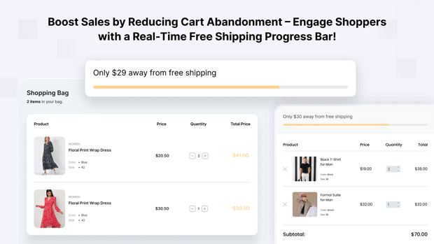
This is where the standard announcement bar falls short and the dynamic free shipping progress bar excels.
- Initial State: “You’re $50 away from free shipping.” This sets a clear goal.
- Mid-Progress: A customer adds a $30 item. The bar instantly updates: “You’re just $20 away!” This provides positive reinforcement and makes the goal feel achievable. The user experiences a sense of progress, motivating them to find a small item to bridge the gap.
- Goal Achieved: The bar triumphantly declares, “Congratulations! You’ve unlocked free shipping!” This delivers a dopamine hit, validating their purchasing decision and creating a positive brand association.
This interactive feedback loop is a classic example of gamification. It motivates users to spend slightly more than they initially intended to “win” the prize of free shipping, directly increasing your store’s Average Order Value.
Recommended Blogs for You:
👉 How to Add a Free Shipping Progress Bar in Shopify
👉 5 Best Free Shipping Bar Apps for Shopify in 2025
👉 How to Set Up Shipping on Shopify: Complete Guide 2025
👉 7 Best Shipping Rate Apps for Shopify 2025
The Anatomy of a High-Converting Free Shipping Bar
An effective eCommerce free shipping bar is more than just a colorful strip at the top of your page. It’s a carefully crafted system of messages. Let’s dissect its core components.
1. The Offer (The Hook)
This is your opening message, the text that appears when the cart is empty. It needs to be crystal clear, concise, and compelling.
- Bad: “Shipping information”
- Good: “Free Shipping On All Orders Over $75”
- Better: “Unlock FREE Express Shipping on orders over $75!”
Best Practices:
- Be Specific: Mention the type of shipping if it’s a selling point (e.g., “Free 2-Day Shipping”).
- Use Action Words: Words like “Unlock,” “Get,” or “Enjoy” are more persuasive than passive language.
- Keep it Short: The entire message should be scannable in a second or two.
2. The Threshold (The Goal)
The free shipping threshold is the single most important number you’ll decide on. Set it too low, and you’ll destroy your profit margins. Set it too high, and you’ll discourage customers from even trying to reach it.
How to Calculate Your Optimal Free Shipping Threshold:
- Calculate Your Current AOV: Export your order data from the last 3-6 months and find the average order value. Let’s say your AOV is $62.
- Find Your Median Order Value: The median is often more reliable than the average, as it isn’t skewed by a few unusually large orders. Let’s say your median is $55.
- Apply the “Sweet Spot” Formula: The ideal threshold is typically 15-20% above your current AOV or median order value. This makes it feel attainable for the majority of your customers.
- Using our AOV: $62 * 1.15 = $71.30
- Using our median: $55 * 1.20 = $66.00
- Round to a Clean Number: Customers respond better to clean, round numbers. Based on the calculations above, a threshold of $75 would be a perfect starting point. It’s slightly above the calculated range, psychologically sounds like a standard benchmark, and encourages a meaningful increase in cart size.
3. The Progress Tracker (The Motivator)
This is the dynamic messaging that updates as customers add items to their cart. This is the engine of the conversion boosting free shipping bar.
- Message 1 (Goal Setting): “You’re just $35.50 away from free shipping!”
- Message 2 (Urgency): “Add $12 more to get free shipping!”
- Visual Feedback: The bar should visually fill up as the customer gets closer to the goal. A simple left-to-right fill animation is incredibly effective.
4. The Success Message (The Reward)
Don’t just stop the updates once the threshold is met. Celebrate the customer’s achievement!
- Good: “You get free shipping.”
- Excellent: “Congratulations! You’ve unlocked free shipping!”
- Pro-Level: “Success! Your order now ships FREE.”
This celebratory message reinforces their decision and adds to the positive experience. Consider changing the bar’s color to a rewarding green or your brand’s primary success color.
5. The Call-to-Action (The Nudge)
A subtle CTA can encourage further action. This is most effective in the progress tracking stage.
- Example: “You’re $15 away! [Keep Shopping]”
The “Keep Shopping” can be a button or link that closes the mini-cart and returns the user to their previous collection page, making it seamless to add more items.
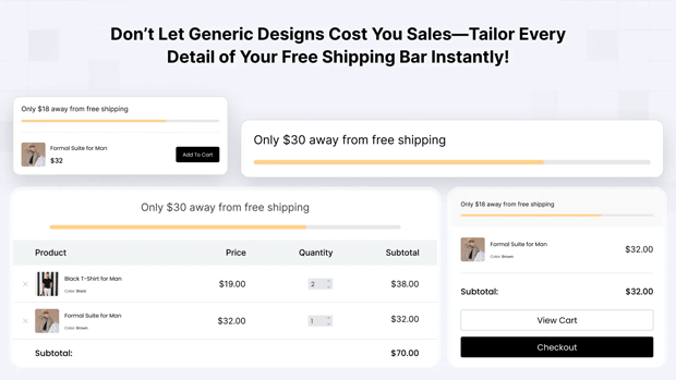
Best Practices for Designing a Free Shipping Bar
A poorly designed bar can be distracting, annoying, and look untrustworthy. A well-designed bar integrates seamlessly with your brand while being impossible to ignore.
This is where mastering free shipping bar design becomes crucial.
Color Psychology and Branding
- On-Brand vs. High-Contrast: You have two primary options. You can use your brand’s primary or secondary colors for a seamless look, or you can use a high-contrast color (that still complements your palette) to make the bar pop. For the success message, a universally understood color like green is often the best choice.
- A/B Test It: There’s no single right answer. A/B test a subtle, on-brand bar against a bold, high-contrast one to see what your specific audience responds to.
Typography and Readability
- Font Choice: Use the same font family as your website for consistency. However, you can use a bolder weight (e.g., Semi-Bold or Bold) to make the message stand out.
- Size Matters: The text must be legible on all devices. A font size of 14px-16px is a good starting point for desktop.
- Clarity Over Cuteness: Avoid overly stylized or script fonts that are difficult to read quickly. The purpose of the bar is communication, not decoration.
Placement and Visibility (The Sticky Situation)
The bar should almost always be placed at the very top of the viewport. The key decision is whether it should be static or “sticky.”
- Static: The bar is visible on page load but scrolls away with the rest of the page.
- Sticky (Recommended): The bar remains “stuck” to the top of the screen as the user scrolls. This keeps the free shipping goal top-of-mind throughout their entire shopping journey. A sticky bar is far more effective for driving action.
Pro Tip: Ensure your sticky bar doesn’t cover up essential navigation elements, especially on mobile. It should push the site content down, not overlay it.
Animations and Microinteractions
Subtlety is key. You want to draw the eye, not induce a seizure.
- On Cart Update: When a user adds an item, the bar’s progress fill should animate smoothly rather than just snapping to the new position. A gentle 0.5-second transition is plenty.
- On Goal Reached: When the threshold is met, you can add a subtle “pulse” or “flash” animation to the bar to celebrate the moment before it settles into its success state.
Mobile-First Design is a Must
Over 50% of eCommerce traffic comes from mobile devices. Your free shipping bar design must be flawless on a small screen.
- Concise Copy: Mobile screens have less real estate. Shorten your messages. “Free shipping over $75” is better than “Enjoy complimentary free shipping when you spend $75 or more.”
- Readable Font Size: Test your bar on actual mobile devices to ensure the text is easily readable without pinching or zooming.
- Bar Height: The bar should be thick enough to be noticeable but not so thick that it takes up a significant portion of the valuable screen space.
Best Free Shipping Bar App for Shopify
When it comes to boosting conversions with a free shipping bar, you don’t need a dozen options, just one that does it all. That’s where GP Free Shipping Bar comes in.
This app makes free shipping irresistible by turning hesitant browsers into confident buyers. With a real-time progress bar, shoppers can instantly see how close they are to unlocking free shipping, motivating them to add more to their cart.
Fully customizable and mobile-friendly, GP Free Shipping Bar adapts to your store’s design while giving you complete control over where and how it appears. Whether you’re a small startup or a growing brand, it’s a “set-it-and-forget-it” tool built to maximize revenue.
Key Features of GP Free Shipping Bar:
- Dynamic Progress Tracking – Display real-time cart value with automatic progress updates.
- Flexible Placement – Show the bar on product pages, cart pages, or inside the cart drawer for maximum visibility.
- Countdown Timers – Create urgency and drive faster checkouts with live countdowns.
- Scheduling Options – Plan your promotions ahead with start and end dates—perfect for flash sales and seasonal campaigns.
- Advanced Customization – Adjust styles, colors, fonts, and placement to match your brand seamlessly.
- Geo & Device Targeting – Apply country-specific rules and display bars only where they’re most effective.
- Language Localization – Speak to your customers in their own language for a more personalized experience.
Advanced Strategies for Optimizing Your Free Shipping Bar
Once you’ve mastered the fundamentals, you can implement advanced tactics to squeeze even more performance out of your bar.
A/B Testing Your Bar for Higher Conversions
Never assume your first version is the best. Continuously test elements to optimize performance.
- Test Your Threshold: Is $75 truly the sweet spot? Test it against $70 or $80 for a few weeks and monitor AOV and conversion rate.
- Test Your Copy: Does “Unlock Free Shipping” perform better than “Get Free Shipping”? Test action words, urgency, and clarity.
- Test Your Colors: Does a bold red bar (for urgency) outperform a cool, on-brand blue one?
Geo-Targeting Your Offers
Shipping costs vary wildly by location. Why should your offer be the same for everyone?
- Domestic vs. International: Offer a lower threshold (e.g., $50) for domestic customers and a higher one (e.g., $150) for international orders where shipping is more expensive. Many Shopify free shipping bar apps allow you to set rules based on the customer’s location.
- Regional Offers: You could even offer free shipping to specific states or regions where you have lower fulfillment costs.
Scarcity and Urgency (Use With Caution)
Adding a countdown timer can be a powerful motivator during a promotion.
- Example: “Free Shipping Weekend! Offer ends in:”
- Warning: Only use real scarcity. If you run a perpetual “ends in 24 hours” timer, customers will quickly learn to ignore it, damaging your brand’s credibility.
Shopify Announcement Bar vs. Free Shipping Bar: What’s the Difference?
This is a common point of confusion. Many Shopify themes come with a built-in “Announcement Bar.
- Shopify Announcement Bar: This is a static text bar. You can type “Free Shipping on orders over $50” in it, and that’s what it will always say. It cannot read the customer’s cart total or update dynamically. It’s better than nothing, but it lacks the interactive, gamified element that drives AOV.
- Dedicated Free Shipping Bar App: This is a dynamic tool. It integrates with the cart, tracks its value in real-time, and updates its messaging and visual progress accordingly. For maximizing conversions and AOV, a dedicated app is always the superior choice.
Real-World Free Shipping Bar Examples That Increase Sales
Let’s look at how some top eCommerce brands implement these strategies.
Example 1: The Minimalist Master – Allbirds
- What they do: Allbirds uses a very thin, on-brand, sticky bar at the top of their page. The text is simple: “Free shipping on orders over $75.”
- Why it works: Their branding is clean and minimalist, and the bar reflects that. It’s unobtrusive but ever-present. When you add items, a subtle message appears in the slide-out cart, telling you how much more you need to spend. It’s a two-part system that feels elegant and integrated.
Example 2: The Gamification Expert – ColourPop Cosmetics
- What they do: ColourPop is famous for its bright, bold branding, and their bar is no exception. It uses high-contrast colors and a clear progress bar that fills up as you shop. The messaging is enthusiastic and celebratory.
- Why it works: Their target audience is younger and responds well to this gamified, visually stimulating approach. The success message “You’ve got free shipping!” feels like winning a prize, perfectly aligning with their fun brand identity.
Example 3: The Value-Stacker – Sephora
- What they do: Sephora often goes beyond just free shipping. Their bar might say, “FREE SHIPPING on $50+ orders. Plus, choose 2 free samples!”
- Why it works: This is called value stacking. They not only remove the pain point (shipping cost) but also add an extra incentive (free samples).This makes reaching the threshold even more appealing and is a brilliant strategy for increasing AOV while also introducing customers to new products.
Practical Checklist: Your Action Plan for a High-Converting Bar
Use this checklist to design your own bar or audit your existing one.
- Calculate Your Threshold: Is your threshold set at 15-20% above your AOV?
- Craft Clear Copy: Is your initial message clear, concise, and action-oriented?
- Enable Dynamic Progress: Does your bar update in real-time as items are added to the cart?
- Design a Celebratory Success Message: Does the bar change to confirm the reward has been unlocked?
- Choose Smart Colors: Are your colors on-brand and/or high-contrast for visibility? Is the success state clear (e.g., green)?
- Ensure Readability: Is the font clear, bold enough, and large enough to be read on all devices?
- Make it Sticky: Does the bar stay visible as users scroll down the page?
- Optimize for Mobile: Have you checked the design on multiple phone sizes to ensure it’s not too large or unreadable?
Frequently Asked Questions
What is the best free shipping threshold to set?
There is no universal “best” number. The optimal threshold is data-driven. Calculate your Average Order Value (AOV) over the past 3-6 months and set your threshold approximately 15-20% higher than that number.
For example, if your AOV is $50, a good starting point for your threshold would be $60. Always round up to a clean, marketable number like $60 or $65.
Should my free shipping bar be sticky?
Yes, in almost all cases. A “sticky” bar remains fixed at the top of the screen as the user scrolls. This keeps the free shipping goal constantly in their view, reminding and motivating them throughout their entire shopping session—from the homepage to the product page to the collection page.
How do I measure the success of my free shipping bar?
Success is measured by tracking two key metrics before and after implementation (or during an A/B test):
Average Order Value (AOV): A successful bar should cause a noticeable increase in your AOV as customers add more items to their cart to reach the threshold.
Conversion Rate: By removing the friction of shipping costs, a good bar should lead to a higher overall conversion rate and a lower cart abandonment rate. Track these metrics in your Shopify or Google Analytics.
Can a free shipping bar hurt my profit margins?
It can if implemented poorly. The key is to set a threshold that absorbs the cost of shipping while still being profitable. Your threshold must be high enough that the increased order value from the customer covers the shipping expense.
What’s better: a static announcement bar or a dynamic free shipping progress bar?
Always factor in your average shipping cost when calculating your AOV and setting your threshold. The goal isn’t just to increase revenue; it’s to increase profitable revenue.
Conclusion
The humble free shipping bar has evolved. It is no longer a simple free shipping announcement bar; it is a sophisticated, psychological tool for conversion rate optimization.
By moving beyond static text and embracing a dynamic, interactive, and beautifully designed progress bar, you are not just informing your customers—you are engaging them in a challenge.
You are giving them a clear goal, a visible path to achieve it, and a satisfying reward for their effort.