The Custom CSS feature gives you complete control over the appearance of GP ‑ Wishlist & Upsell Suite widgets. This guide shows you how to use custom CSS to match the app’s look and feel with your store’s branding.
Note: Custom CSS is a Pro plan feature. Free plan users will need to upgrade to access this functionality.
Accessing the CSS Editor
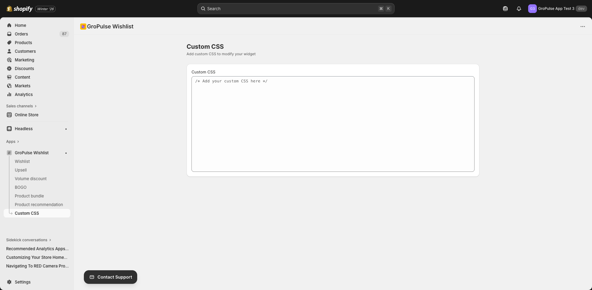
- Navigate to Custom CSS in the main menu
- The CSS editor page opens with a code editor
The CSS Editor Interface
Editor Features
The custom CSS editor includes:
- Syntax highlighting — CSS code is color-coded for readability
- Line numbers — Easy reference for debugging
- Auto-save bar — Shows when you have unsaved changes
- Save/Discard buttons — Contextual action bar appears when changes are made
Saving Changes
- Enter your CSS code in the editor
- A save bar appears at the top when changes are detected
- Click Save to apply changes
- Click Discard to revert to previous state
Understanding Widget Classes
Each GP ‑ Wishlist & Upsell Suite widget has specific CSS classes you can target.
Wishlist Button Classes
/* Main wishlist button */
.gp-wishlist-button { }

/* Button icon */
.gp-wishlist-button-icon { }

/* Button text */
.gp-wishlist-button-text { }

/* Active/added state */
.gp-wishlist-button.active { }

/* Hover state */
.gp-wishlist-button:hover { }
Wishlist Page Classes
/* Wishlist container */
.gp-wishlist-container { }

/* Wishlist item */
.gp-wishlist-item { }

/* Product image */
.gp-wishlist-item-image { }

/* Product title */
.gp-wishlist-item-title { }

/* Product price */
.gp-wishlist-item-price { }

/* Remove button */
.gp-wishlist-remove-btn { }

/* Move to cart button */
.gp-wishlist-add-to-cart { }
Volume Discount Widget
/* Widget container */
.gp-volume-discount { }

/* Tier option */
.gp-volume-tier { }

/* Selected tier */
.gp-volume-tier.selected { }

/* Tier title */
.gp-volume-tier-title { }

/* Tier savings */
.gp-volume-tier-savings { }
BOGO Widget
/* BOGO container */
.gp-bogo-widget { }

/* Trigger section */
.gp-bogo-trigger { }

/* Reward section */
.gp-bogo-reward { }

/* Deal badge */
.gp-bogo-badge { }

/* CTA button */
.gp-bogo-add-to-cart { }
Upsell Widget
/* Upsell container */
.gp-upsell-widget { }

/* Product card */
.gp-upsell-product { }

/* Product image */
.gp-upsell-product-image { }

/* Add to cart */
.gp-upsell-add-btn { }
Product Bundle Widget
/* Bundle container */
.gp-bundle-widget { }

/* Bundle product */
.gp-bundle-product { }

/* Bundle total */
.gp-bundle-total { }

/* Savings banner */
.gp-bundle-savings { }
Product Recommendations
/* Recommendations container */
.gp-recommendations { }

/* Carousel */
.gp-recommendations-carousel { }

/* Product card */
.gp-recommendation-product { }

/* Navigation arrows */
.gp-recommendations-nav { }
Common Customizations
Changing Button Colors
/* Primary button color */
.gp-wishlist-button {
  background-color: #your-brand-color !important;
  border-color: #your-brand-color !important;
}

.gp-wishlist-button:hover {
  background-color: #your-hover-color !important;
}
Adjusting Font Styles
/* Widget titles */
.gp-widget-title {
  font-family: 'Your Font', sans-serif !important;
  font-size: 18px !important;
  font-weight: 600 !important;
}

/* Product titles */
.gp-product-title {
  font-size: 14px !important;
  text-transform: uppercase !important;
}
Modifying Spacing
/* Widget padding */
.gp-volume-discount {
  padding: 24px !important;
  margin: 16px 0 !important;
}

/* Item spacing */
.gp-wishlist-item {
  margin-bottom: 16px !important;
  padding: 12px !important;
}
Adding Borders and Shadows
/* Card-style widgets */
.gp-bundle-widget {
  border: 1px solid #e0e0e0 !important;
  border-radius: 8px !important;
  box-shadow: 0 2px 8px rgba(0, 0, 0, 0.1) !important;
}

/* Hover effects */
.gp-upsell-product:hover {
  box-shadow: 0 4px 12px rgba(0, 0, 0, 0.15) !important;
  transform: translateY(-2px) !important;
}
Hiding Elements
/* Hide specific elements */
.gp-wishlist-share-btn {
  display: none !important;
}

/* Hide on mobile */
@media (max-width: 768px) {
  .gp-recommendations-nav {
    display: none !important;
  }
}
Responsive Design
Mobile Adjustments
/* Mobile-specific styles */
@media (max-width: 768px) {
  .gp-volume-discount {
    padding: 12px !important;
  }

  .gp-volume-tier {
    flex-direction: column !important;
    text-align: center !important;
  }

  .gp-wishlist-button {
    width: 100% !important;
  }
}
Tablet Adjustments
@media (min-width: 769px) and (max-width: 1024px) {
  .gp-recommendations-carousel {
    grid-template-columns: repeat(3, 1fr) !important;
  }
}
Best Practices
Use Specific Selectors
/* Good - specific selector */
.gp-wishlist-button.product-page {
  background-color: #000 !important;
}

/* Avoid - too generic */
button {
  background-color: #000 !important;
}
Use !important Sparingly
The !important declaration is often needed to override default styles, but use it judiciously:
/* Use when necessary to override defaults */
.gp-widget-title {
  color: #333 !important;
}
Test Across Devices
Always test your CSS on:
- Desktop browsers (Chrome, Safari, Firefox)
- Mobile devices (iOS, Android)
- Different screen sizes
Keep Code Organized
/* ============================
   WISHLIST BUTTON STYLES
   ============================ */

.gp-wishlist-button {
  /* Base styles */
}

/* ============================
   VOLUME DISCOUNT STYLES
   ============================ */

.gp-volume-discount {
  /* Base styles */
}
Document Your Changes
/*
 * Custom brand color - matches header
 * Updated: 2024-01-15
 */
.gp-wishlist-button {
  background-color: #2563eb !important;
}
Troubleshooting
Styles Not Applying
- Check selector specificity — Use more specific selectors
- Add !important — Override default styles
- Clear cache — Browser and Shopify theme cache
- Check syntax — Ensure CSS is valid
Finding the Right Class
- Open your store in a browser
- Right-click on the element you want to style
- Select Inspect or Inspect Element
- Find the class name in the Elements panel
- Use that class in your CSS
Conflicting Styles
If your theme conflicts with widget styles:
/* Increase specificity */
body .gp-wishlist-container .gp-wishlist-button {
  /* Your styles */
}

/* Or use ID if available */
#gp-wishlist-widget .gp-wishlist-button {
  /* Your styles */
}
Examples
Minimal Modern Style
/* Clean, minimal appearance */
.gp-wishlist-button {
  background: transparent !important;
  border: 2px solid #000 !important;
  color: #000 !important;
  border-radius: 0 !important;
  text-transform: uppercase !important;
  letter-spacing: 1px !important;
}

.gp-wishlist-button:hover {
  background: #000 !important;
  color: #fff !important;
}
Rounded Soft Style
/* Soft, friendly appearance */
.gp-volume-tier {
  border-radius: 16px !important;
  background: #f8f9fa !important;
  border: none !important;
}

.gp-volume-tier.selected {
  background: #e3f2fd !important;
  box-shadow: 0 0 0 2px #2196f3 !important;
}
Dark Mode Compatible
/* Respect dark mode preferences */
@media (prefers-color-scheme: dark) {
  .gp-wishlist-container {
    background: #1a1a1a !important;
    color: #fff !important;
  }

  .gp-wishlist-item {
    border-color: #333 !important;
  }
}
What’s Next?
Continue customizing your store:
- Theme Extension Integration — Widget placement
- Email Templates & Social Links — Email customization
- Understanding Your Analytics — Track performance
Custom CSS gives you the power to make GP ‑ Wishlist & Upsell Suite look exactly like your brand — take full control of your styling.