Analytics are the key to measuring success and optimizing your store’s performance. GP ‑ Wishlist & Upsell Suite provides comprehensive analytics across all features, helping you understand customer behavior and maximize ROI.
Why Analytics Matter
Data-driven decisions lead to better outcomes:
- Measure ROI — See exactly how much revenue each feature generates
- Identify trends — Spot patterns in customer behavior
- Optimize strategy — Adjust campaigns based on performance
- Track growth — Monitor progress over time
- Find opportunities — Discover areas for improvement
Analytics Overview
GP ‑ Wishlist & Upsell Suite provides analytics for multiple features:
| Feature | Dashboard Location |
|---|---|
| Store Performance | Home page KPI cards |
| Wishlist | Wishlist > Dashboard |
| Email Notifications | Wishlist > Email Notifications > Analytics |
| Volume Discount | Volume Discount > Dashboard |
| BOGO Offers | BOGO > Dashboard |
| Upsell Offers | Upsell > Dashboard |
| Product Bundles | Product Bundle > Dashboard |
| Product Recommendations | Product Recommendation > Dashboard |
Store Performance Cards
The home page displays four key performance indicators (KPIs) for the last 30 days:
Total Revenue
- Revenue generated through app features
- Shows change percentage from previous period
- Displayed in your store’s currency
Conversion Rate
- Percentage of visitors who made purchases
- Indicates overall effectiveness
- Higher is better
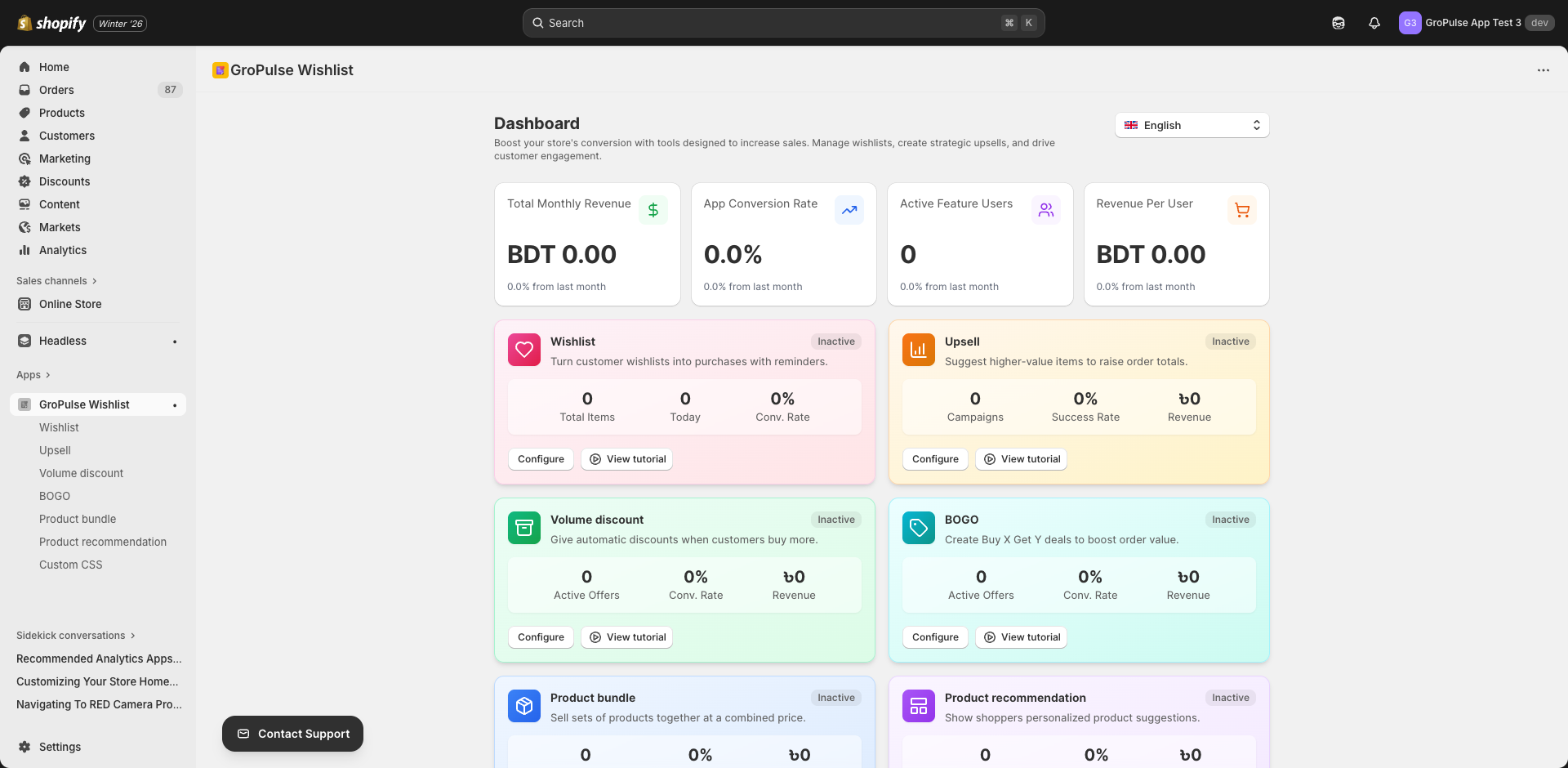
Active Users
- Customers engaging with app features
- Measures customer reach
- Growth indicates adoption
Revenue Per User
- Average revenue per active customer
- Key profitability metric
- Helps measure customer value
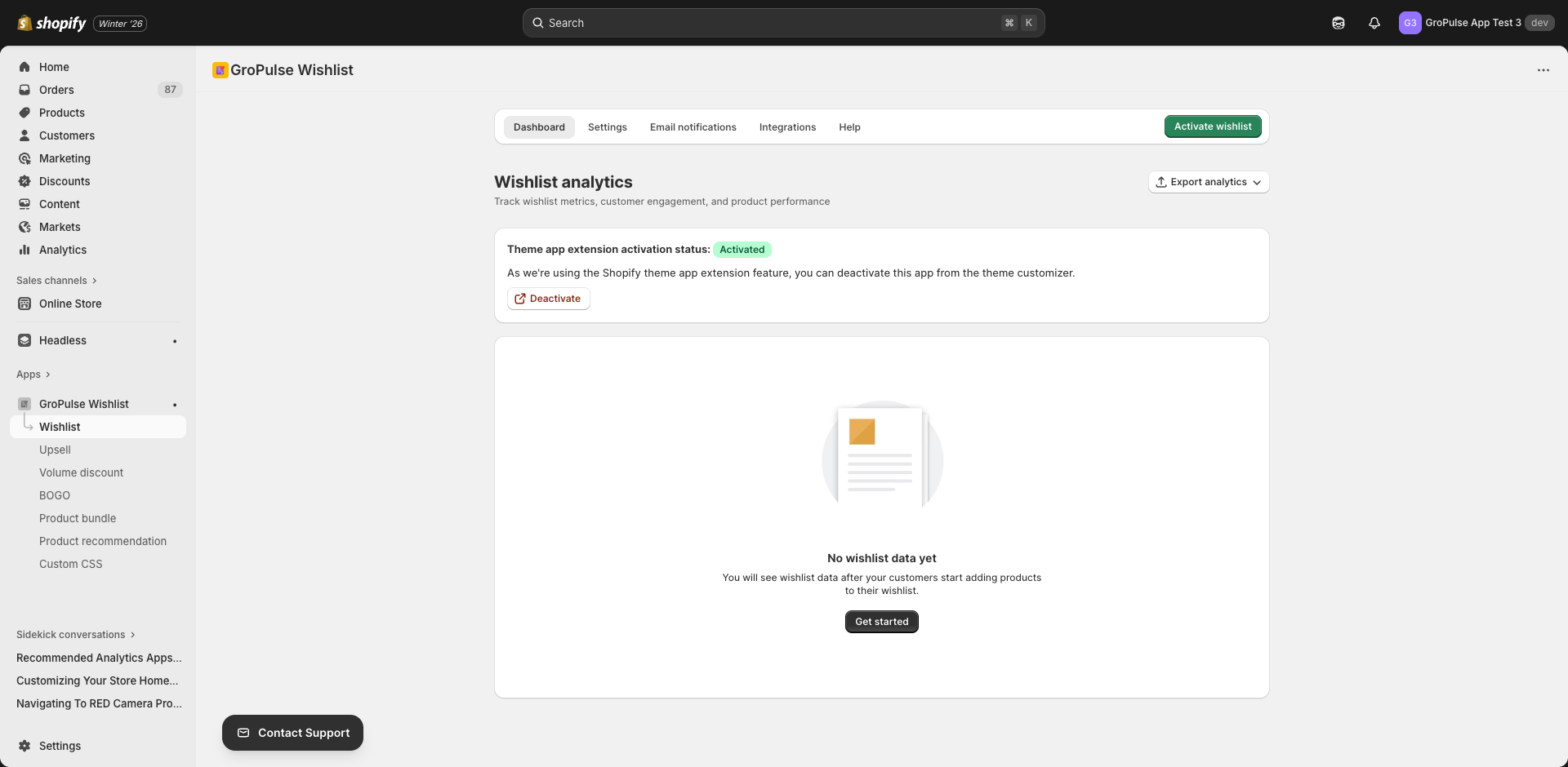
Wishlist Dashboard
The wishlist dashboard provides detailed insights into wishlist activity.
Accessing the Dashboard
- Navigate to Wishlist in the main menu
- Click the Dashboard tab
- View comprehensive wishlist analytics
Key Metrics
| Metric | Description |
|---|---|
| Total Wishlisted Products | Number of products currently in wishlists |
| Total Wishlist Interactions | All add/remove actions taken |
| Total Customers | Customers with active wishlists |
Trend Analysis
The trend chart shows wishlist activity over time:
- Monthly wishlist additions
- Activity patterns
- Seasonal trends
Top Products Table
See which products are most wishlisted:
| Column | Description |
|---|---|
| Product Name | Link to product page |
| Wishlist Count | Times added to wishlists |
Top Customers Table
Identify your most engaged customers:
| Column | Description |
|---|---|
| Customer Email | Customer identifier |
| Items Wishlisted | Number of wishlist items |
Date Filtering
Filter data by time period:
- Last 30 days — Recent activity
- Last 90 days — Quarterly view
- This year — Annual perspective
- All time — Complete history
- Custom — Specific date range
Exporting Data
Export your data for further analysis:
- Click Export Analytics
- Choose export type:
- All data
- Products only
- Customers only
- Download as CSV
Email Analytics Dashboard
Track the performance of your email notifications.
Accessing Email Analytics
- Go to Wishlist > Email Notifications
- Click the Analytics tab
- Select email type to analyze
Email Types to Analyze
- Wishlist Reminders
- Back-in-Stock Notifications
- Bulk Discounts
- Price Drop Alerts
- Abandoned Wishlist Recovery
Email Metrics
| Metric | Description | Good Benchmark |
|---|---|---|
| Total Emails Sent | Number of emails delivered | — |
| Open Rate | % who opened the email | > 25% |
| Click-Through Rate | % who clicked a link | > 3% |
| Conversion Rate | % who made a purchase | > 1% |
| Total Revenue | Sales from emails | Varies |
| Revenue Per Email | Average revenue per email | > $1 |
Performance Summary
Quick view of email engagement:
- Unique Openers — Distinct customers who opened
- Unique Clickers — Distinct customers who clicked
- Conversions — Purchases made
- Total Impressions — Email views
- Total Clicks — Link clicks
Recent Campaigns Table
View individual campaign performance:
| Column | Description |
|---|---|
| Campaign ID | Unique identifier |
| Customer Email | Recipient |
| Sent Date | When email was sent |
| Opens | Number of opens |
| Clicks | Number of clicks |
| Revenue | Generated revenue |
| Status | Converted or Sent |
Performance Insights
Automatic insights based on your data:
| Insight Type | Trigger | Recommendation |
|---|---|---|
| Excellent open rate | > 25% | Subject lines are effective |
| Low open rate | < 15% | Improve subject lines |
| Great click-through | > 3% | Content is engaging |
| Low click-through | < 1% | Improve CTAs and content |
| Strong revenue | > $1/email | Keep current strategy |
Promotional Feature Analytics
Volume Discount, BOGO, Upsell, Bundle, and Recommendation features share similar analytics dashboards.
Common Metrics
All promotional features track four key metrics:
| Metric | Description | Icon Color |
|---|---|---|
| Impressions | Times widget was shown | Blue |
| Clicks | User interactions | Purple |
| Conversions | Completed purchases | Green |
| Revenue | Sales generated | Orange |
Percentage Changes
Each metric shows change from the previous period:
- Green arrow up — Improvement
- Red arrow down — Decline
- Gray — No significant change
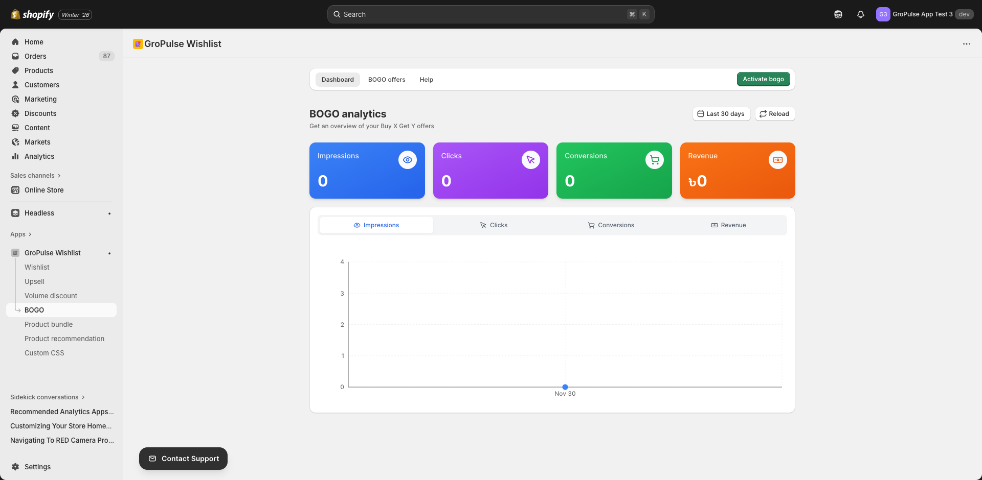
Performance by Day
View daily performance in a chart:
- Visualize trends over time
- Identify peak days
- Spot anomalies
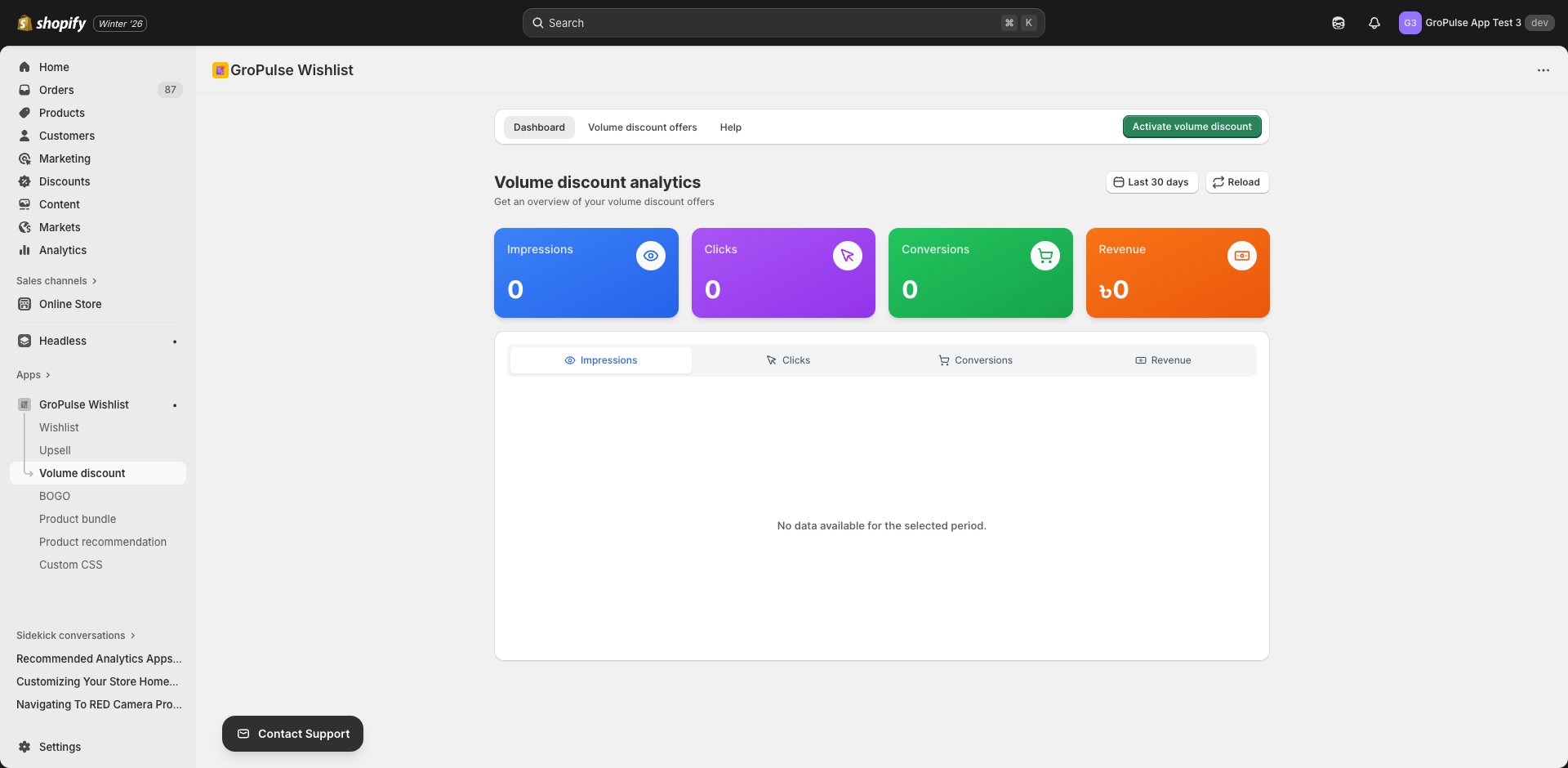
Date Range Selection
Filter by predefined ranges:
| Range | Description |
|---|---|
| Today | Current day only |
| Yesterday | Previous day |
| Last 7 days | Past week |
| Last 30 days | Past month |
| Last 90 days | Past quarter |
Or set a custom date range for specific analysis.
Interpreting Your Data
Understanding Impressions
Impressions show visibility:
| Level | Interpretation | Action |
|---|---|---|
| Low | Widget not visible | Check placement, theme extension |
| Medium | Good visibility | Optimize for clicks |
| High | Excellent reach | Focus on conversion |
Click-Through Rate
Calculate: (Clicks / Impressions) x 100
| Rate | Assessment | Action |
|---|---|---|
| < 1% | Poor engagement | Improve design, offer |
| 1-3% | Average | Test variations |
| > 3% | Good | Maintain, expand |
Conversion Rate
Calculate: (Conversions / Clicks) x 100
| Rate | Assessment | Action |
|---|---|---|
| < 2% | Low conversion | Review offer value |
| 2-5% | Average | Optimize checkout flow |
| > 5% | Good | Scale successful offers |
Revenue Per Impression
Calculate: Revenue / Impressions
This metric shows the value of each widget view, helping you compare different features and offers.
Best Practices
Regular Monitoring
| Frequency | Focus |
|---|---|
| Daily | Quick health check |
| Weekly | Trend analysis |
| Monthly | Strategic review |
| Quarterly | Major optimizations |
What to Track
- Overall trends — Is performance improving?
- Feature comparison — Which features perform best?
- Offer comparison — Which offers convert most?
- Email comparison — Which email types work best?
- Customer patterns — Who engages most?
Acting on Data
| Finding | Action |
|---|---|
| High impressions, low clicks | Improve offer visibility, design |
| High clicks, low conversions | Review offer value, pricing |
| Low impressions | Check widget placement |
| Declining trend | Refresh offers, test new approaches |
| Seasonal patterns | Plan campaigns accordingly |
A/B Testing Ideas
Use analytics to compare:
- Different discount percentages
- Various widget placements
- Multiple design styles
- Different email subject lines
- Alternative CTAs
Exporting and Reporting
CSV Exports
Most dashboards support CSV export:
- Click the export button
- Select data type
- Download file
- Open in spreadsheet software
Creating Reports
Combine data for stakeholder reports:
- Export relevant dashboards
- Compile in spreadsheet
- Create visualizations
- Add insights and recommendations
Troubleshooting Analytics
No Data Showing
- Verify features are enabled
- Check theme extension is active
- Confirm enough time has passed
- Ensure tracking is working
Low Numbers
- New store? Give it time
- Check widget visibility
- Review offer attractiveness
- Verify proper configuration
Data Discrepancies
- Check date ranges match
- Verify you’re comparing same metrics
- Consider currency conversions
- Allow time for data processing
Key Takeaways
- Monitor regularly — Check analytics at least weekly
- Compare periods — Look at trends, not just snapshots
- Act on insights — Use data to improve strategy
- Test continuously — Try new approaches based on findings
- Export for deeper analysis — Use spreadsheets for detailed review
What’s Next?
Apply your analytics knowledge:
- Getting Started — Review initial setup
- Creating Volume Discounts — Optimize promotions
- Email Templates & Social Links — Improve email performance
Analytics transform guesswork into strategy — let data guide your decisions for better results.