This guide explains how to customize the visual appearance of your popup campaign, including colors, dimensions, close button, and animations.
Accessing Design Settings
- Open the Popup Campaign Editor
- Click the Design Settings tab
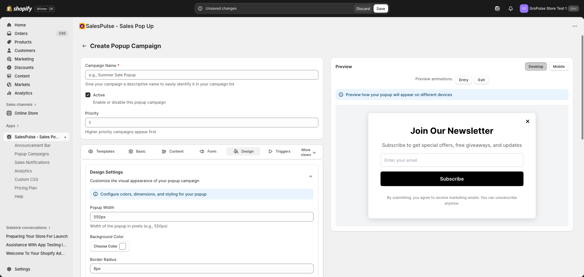
Popup Dimensions
Popup Width
Set the width of your popup:
- Default:
550px - Enter values with units:
550px,600px,80% - Recommended range: 400px – 700px for center modals
Color Settings
Background Color
Set the main background color of your popup:
- Click the Choose Color button next to “Background Color”
- Use the color picker to select a color
- Or enter a hex code directly (e.g., #FFFFFF)
Overlay Opacity
Control the darkness of the background overlay behind the popup:
- Range: 0 (transparent) to 1 (fully opaque)
- Default: 0.5
- Use the slider to adjust
Tips:
- Higher opacity (0.7-0.8) focuses attention on the popup
- Lower opacity (0.3-0.4) keeps the store visible behind
- Very low opacity may make the popup less noticeable
Close on Overlay Click
Enable or disable closing the popup when clicking outside:
- Checked: Visitors can close by clicking the overlay
- Unchecked: Visitors must use the close button
Border & Spacing
Border Radius
Control the roundness of popup corners:
- Default:
8px - Enter values like:
0px(sharp corners),8px(slightly rounded),16px(more rounded)
Padding
Control the inner spacing of the popup:
- Default:
40px - Enter values like:
32px,40px,48px - More padding creates breathing room for content
Close Button Settings
Configure the close button appearance and behavior.
Show Close Button
Toggle to show or hide the close button:
- Checked: Close button is visible
- Unchecked: No close button (not recommended)
Button Position
Choose where the close button appears:
| Position | Description |
|---|---|
| Top Right | Standard position (recommended) |
| Top Left | Alternative position |
Button Style
Choose how the close button looks:
| Style | Description |
|---|---|
| Icon (x) | Simple X icon (default) |
| Custom Text | Use custom text like “Close” |
Button Colors
| Setting | Description |
|---|---|
| Button Color | Color of the X icon or text |
| Background Color | Background color of the button |
Button Size
Control the size of the close button:
- Default: 24px
- Range: 16px – 40px
- Larger sizes are easier to tap on mobile
Show After Delay
Delay showing the close button:
- Default: 0 seconds (show immediately)
- Set a delay to ensure visitors see the offer first
- Be careful not to frustrate visitors with long delays
Enable Escape Key
Allow visitors to close the popup by pressing Escape:
- Checked: Escape key closes popup
- Unchecked: Escape key has no effect
Animation Settings
Click More views then Animation Settings to configure animations.
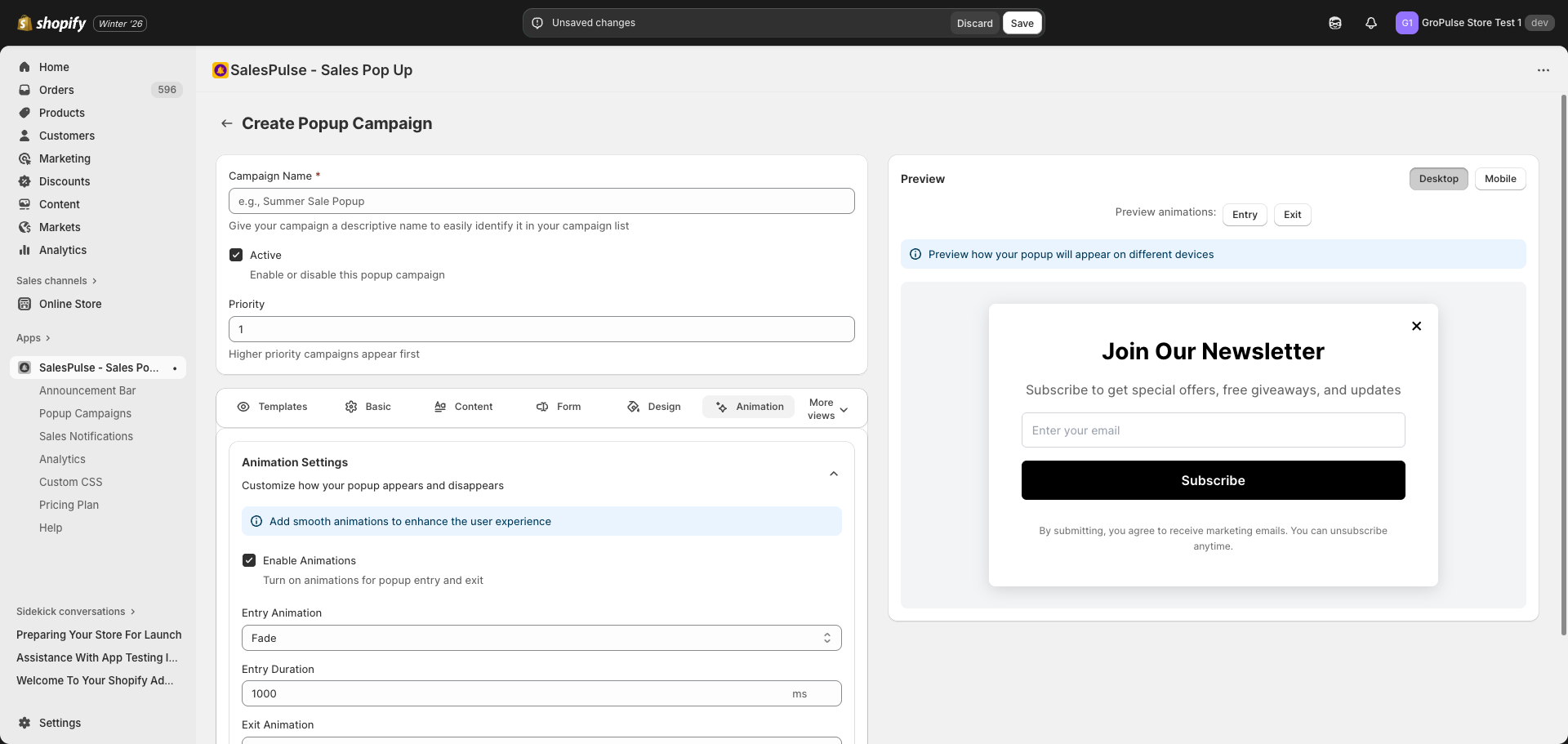
Enable Animations
Check Enable animations to activate motion effects.
Entry Animation
How the popup appears when loading:
| Animation | Description |
|---|---|
| Fade | Fades in gradually (default) |
| Slide Up | Slides up from bottom |
| Slide Down | Slides down from top |
| Slide Left | Slides in from right |
| Slide Right | Slides in from left |
| Zoom | Grows from small to full size |
| Bounce | Bounces into view |
Entry Duration
Control how long the entry animation takes:
- Default: 1000ms (1 second)
- Range: 100ms – 2000ms
- Shorter = snappier, longer = smoother
Exit Animation
How the popup disappears when closed:
| Animation | Description |
|---|---|
| Fade | Fades out gradually (default) |
| Slide Up | Slides up and out |
| Slide Down | Slides down and out |
| Slide Left | Slides out to left |
| Slide Right | Slides out to right |
| Zoom | Shrinks before disappearing |
| Bounce | Bounces out |
Exit Duration
Control how long the exit animation takes:
- Default: 500ms
- Range: 100ms – 2000ms
- Exit animations are typically faster than entry
Popup Types and Design
Different popup types have different design considerations:
Center Modal
- Most versatile option
- Works well with any content
- Standard width: 500-600px
- Good for forms and promotions
Bottom Right/Left Corner
- Non-intrusive design
- Smaller width recommended: 350-400px
- Good for subtle notifications
- Works well with minimal content
Fullscreen
- Maximum impact
- Use sparingly to avoid frustrating visitors
- Great for major announcements
- Ensure content fills the space well
Right/Left Sidebar
- Slides in from the edge
- Width should be 300-400px
- Good for product recommendations
- Works well for navigation
Design Best Practices
Color Contrast
- Ensure text is readable against the background
- Use dark text on light backgrounds, or light text on dark backgrounds
- Test with the live preview on both desktop and mobile
Brand Consistency
- Match your store’s color scheme
- Use consistent styling across all popups
- Maintain brand recognition
Mobile Considerations
- Test designs on mobile view
- Ensure touch targets are large enough (close button, form fields)
- Keep content concise for smaller screens
- Consider using a different popup type for mobile
Accessibility
- Ensure close buttons are visible and accessible
- Use sufficient color contrast (WCAG guidelines)
- Avoid relying only on color to convey information
- Enable keyboard navigation (Escape key)