This guide explains how to customize the visual appearance of your announcement bar, including colors, typography, layout, position, and animations.
Accessing Design Settings
- Open the Announcement Bar Editor
- Click the Design Settings tab
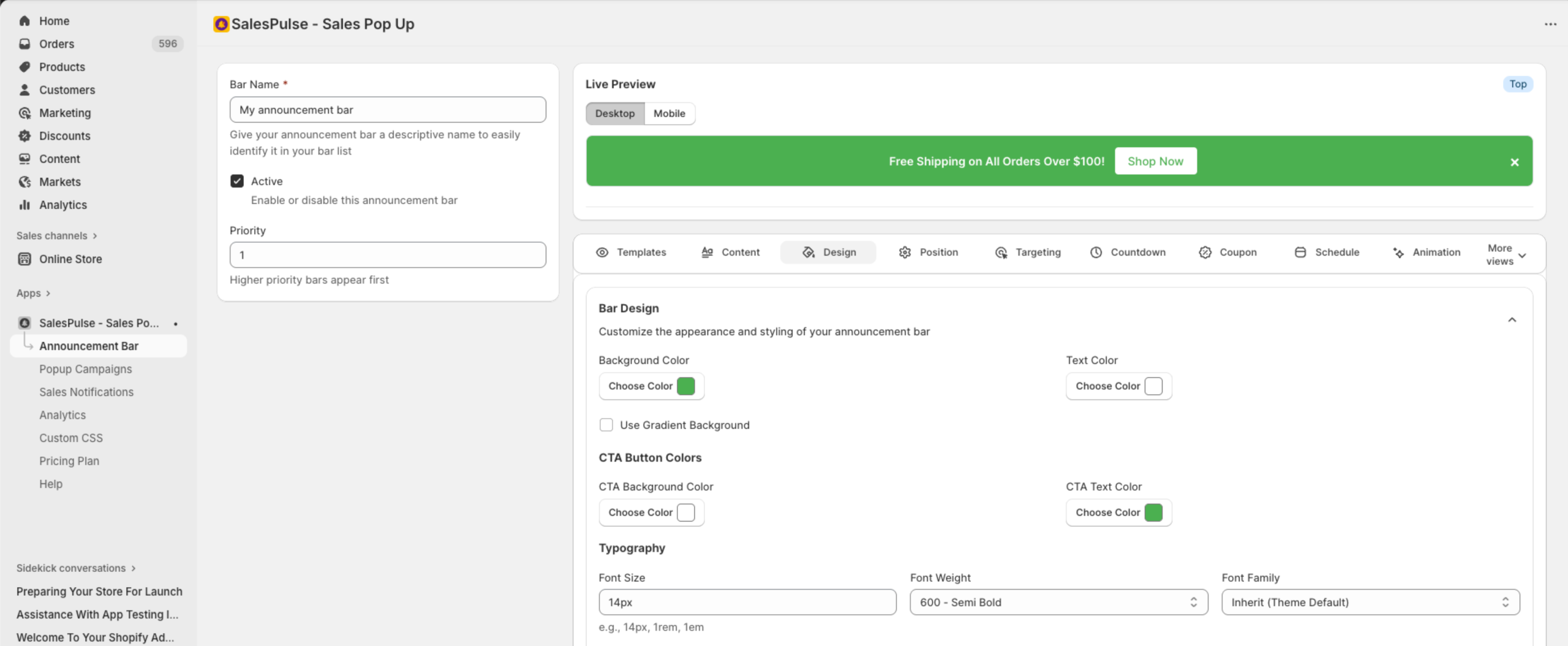
Color Settings
Background Color
Set the main background color of your announcement bar:
- Click the Choose Color button next to “Background Color”
- Use the color picker to select a color
- Or enter a hex code directly (e.g., #000000)
Gradient Backgrounds
For more dynamic designs, enable gradient backgrounds:
- Check Use Gradient Background
- Configure the gradient start and end colors
- Choose the gradient direction
Text Color
Set the color for your announcement text:
- Click the Choose Color button below “Text Color”
- Select a color that contrasts well with your background
- Preview the result in the live preview
CTA Button Colors
Customize your call-to-action button:
| Setting | Description |
|---|---|
| CTA Background Color | Button background color |
| CTA Text Color | Button text color |
Tip: Use contrasting colors to make your CTA button stand out from the bar background.
Typography Settings
Font Size
Control the text size:
- Default: 14px
- Enter values with units:
14px,1rem,1em - Larger sizes (16px-18px) work well for important messages
Font Weight
Choose how bold your text appears:
| Option | Value | Use Case |
|---|---|---|
| Normal | 400 | Standard text |
| Bold | 700 | Emphasis |
| 100 – Thin | 100 | Light, elegant look |
| 200 – Extra Light | 200 | Subtle emphasis |
| 300 – Light | 300 | Slightly lighter than normal |
| 400 – Normal | 400 | Standard weight |
| 500 – Medium | 500 | Slightly bolder than normal |
| 600 – Semi Bold | 600 | Moderate emphasis |
| 700 – Bold | 700 | Strong emphasis |
| 800 – Extra Bold | 800 | Very bold |
| 900 – Black | 900 | Maximum boldness |
Font Family
Select a font for your announcement:
| Option | Description |
|---|---|
| Inherit (Theme Default) | Uses your theme’s font |
| Arial | Clean, widely available sans-serif |
| Helvetica | Classic, professional sans-serif |
| Georgia | Elegant serif font |
| Times New Roman | Traditional serif font |
| Courier | Monospace font |
| Verdana | Readable sans-serif |
| Roboto | Modern Google font |
| Open Sans | Friendly Google font |
| Lato | Warm, modern Google font |
Recommendation: Use “Inherit (Theme Default)” for consistency with your store’s branding.
Layout Settings
Text Alignment
Control how text is positioned within the bar:
| Option | Description |
|---|---|
| Left | Align text to the left |
| Center | Center text (default) |
| Right | Align text to the right |
Height
Set the bar height:
- Default:
auto(adjusts to content) - Fixed heights:
50px,60px,3rem - Use
autofor responsive behavior
Padding
Control the space inside the bar:
- Default:
12px 20px(12px top/bottom, 20px left/right) - Adjust for more or less breathing room
- Format:
vertical horizontalortop right bottom left
Position Settings
Click the Position Settings tab to configure bar placement.
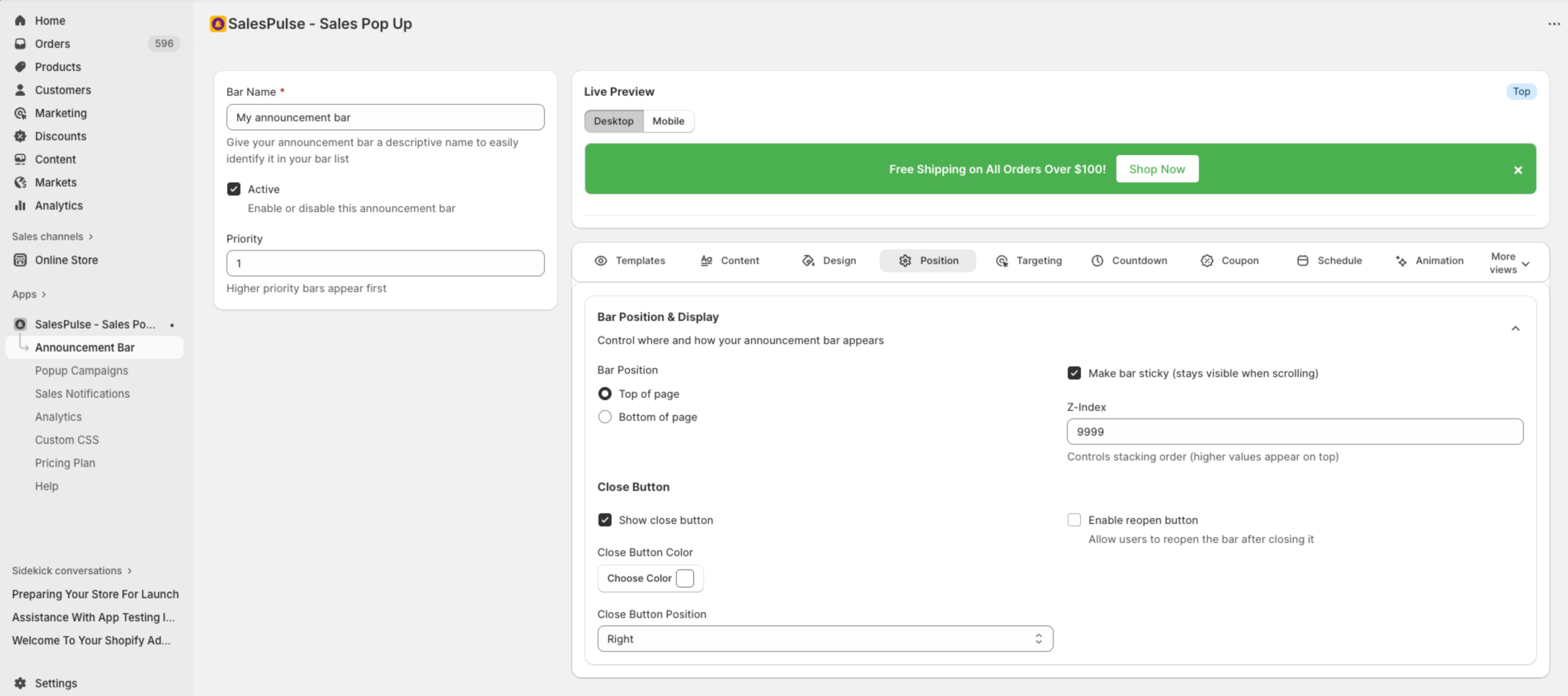
Bar Position
Choose where the bar appears on the page:
| Option | Description |
|---|---|
| Top of page | Bar appears at the top (recommended) |
| Bottom of page | Bar appears at the bottom |
Sticky Behavior
- Make bar sticky: When enabled, the bar stays visible as users scroll
- Recommended for important announcements
Z-Index
Controls the stacking order (which elements appear on top):
- Default: 9999
- Higher values appear above other elements
- Increase if your bar appears behind other elements
Close Button Settings
Show Close Button
Toggle to allow visitors to dismiss the bar:
- Enabled: Visitors can close the bar
- Disabled: Bar cannot be dismissed
Close Button Customization
When close button is enabled:
| Setting | Options |
|---|---|
| Close Button Color | Color picker for the X icon |
| Close Button Position | Left or Right |
Reopen Button
Allow visitors to reopen the bar after closing:
- Check Enable reopen button
- Configure reopen button options:
| Setting | Options |
|---|---|
| Icon Type | Arrow, Chevron, or Plus |
| Button Position | Left, Center, or Right |
| Custom Background Color | Optional custom color |
| Custom Icon Color | Optional custom color |
Animation Settings
Click the Animation Settings tab to add smooth motion effects.
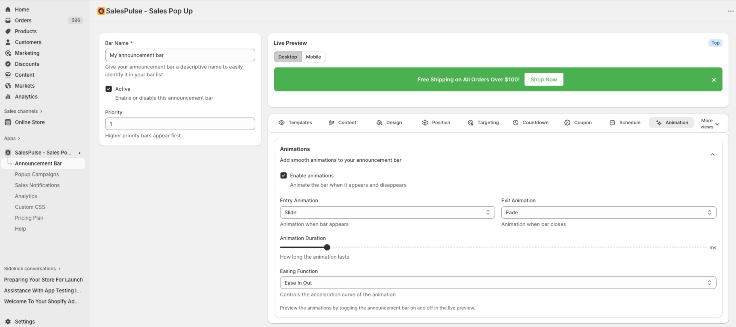
Enable Animations
Check Enable animations to activate motion effects.
Entry Animation
How the bar appears when loading:
| Animation | Description |
|---|---|
| Slide | Slides in from top or bottom |
| Fade | Fades in gradually |
| Bounce | Bounces into view |
| Scale | Grows from small to full size |
| None | Appears instantly |
Exit Animation
How the bar disappears when closed:
| Animation | Description |
|---|---|
| Slide | Slides out of view |
| Fade | Fades out gradually |
| Bounce | Bounces out |
| Scale | Shrinks before disappearing |
| None | Disappears instantly |
Animation Duration
Control how long animations take:
- Range: 100ms to 2000ms
- Default: 300ms
- Shorter = snappier, longer = smoother
Easing Function
Controls the acceleration curve of animations:
| Option | Description |
|---|---|
| Linear | Constant speed throughout |
| Ease | Starts slow, speeds up, ends slow |
| Ease In | Starts slow, speeds up |
| Ease Out | Starts fast, slows down |
| Ease In Out | Starts and ends slow (default) |
Design Best Practices
Color Contrast
- Ensure text is readable against the background
- Use dark text on light backgrounds, or light text on dark backgrounds
- Test with the live preview on both desktop and mobile
Brand Consistency
- Match your store’s color scheme
- Use your brand fonts when possible
- Maintain consistent styling across all bars
Mobile Considerations
- Test designs on mobile view
- Ensure touch targets are large enough (close button, CTA)
- Keep messages short for smaller screens
Accessibility
- Ensure close buttons are visible and clickable
- Avoid relying only on color to convey information