Matching the free shipping bar to your store’s unique brand identity is crucial for a professional look and feel. Our app provides a comprehensive set of design options to give you full control over the appearance of each bar.
You can find these settings within the configuration page for each bar type. The available options may vary slightly depending on where the bar is displayed.
Top/Bottom Bar Appearance
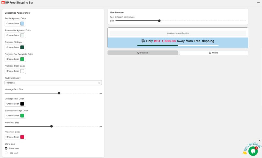
The classic Top/Bottom bar has the following options to control its look:
- Bar Background Color: Sets the main background color of the bar before the goal is met.
- Success Background Color: Sets the background color of the bar after the customer reaches the free shipping goal.
- Progress Fill Color: The color of the animated progress bar as it fills up towards the goal.
- Progress Bar Complete Color: The color of the progress bar once it is 100% full.
- Progress Track Color: The color of the empty portion of the progress bar’s track.
- Text Font Family: Choose from a list of web-safe fonts (Arial, Verdana, etc.) to match your brand.
- Message Text Size: Adjust the font size of the main message in pixels (px).
- Message Text Color: The color of the main message text (e.g., “You’re only $10 away…”).
- Success Message Color: The color of the text when the success message is displayed.
- Price Text Size: Adjust the font size for any price-related text in your message.
- Price Text Color: The color of the price-related text.
Product Page, Cart Page, & Cart Drawer Design Settings
The bars that display on the Product Page, Cart Page, and in the Cart Drawer are designed as “cards” or “blocks” and share a similar set of powerful customization options, organized into three groups:
1. Card Design
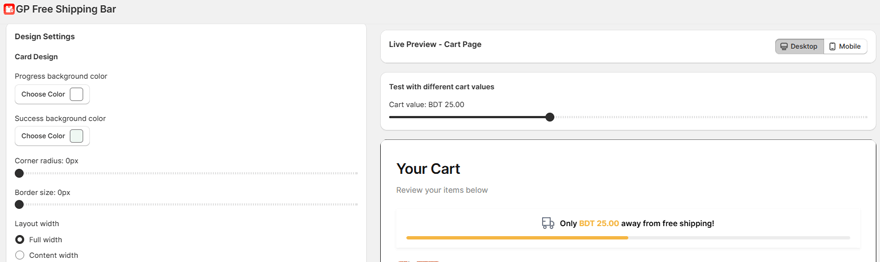
This group controls the appearance of the container block itself.
- Progress background color: Sets the background color of the entire card before the goal is met.
- Success background color: Sets the background color of the entire card after the goal is met.
- Corner radius: Controls how rounded the corners of the card are. A value of 0px creates sharp corners, while a higher value creates a more rounded look.
- Border size: Sets the thickness of the border around the outside of the card. A value of 0px means there is no border.
- Layout width (Cart Page Only): Choose how wide the card should be on your cart page. Full width will stretch to the edges of its container, while Content width will match the width of your main store content.
2. Progress Bar
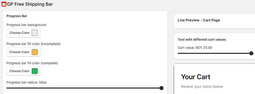
This group controls the look of the progress bar animation within the card.
- Progress bar background: The color of the track that the progress bar fills.
- Progress bar fill color (incomplete): The color of the bar as it fills up towards the goal.
- Progress bar fill color (complete): The color of the bar once the goal has been reached.
- Progress bar radius: Controls the roundness of the progress bar itself. A high value like 50px will create a “pill” shape.
3. Typography
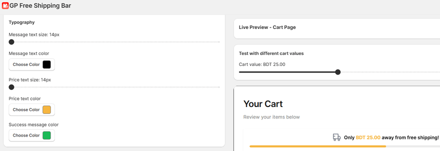
This group controls all the text settings within the card.
- Message text size: The font size of the main message.
- Message text color: The color of the main message text.
- Price text size: The font size of any price text (e.g., the {{amount_left}} value).
- Price text color: The color of the price text.
- Success message color: The color of the text when the success message is displayed.