Customize the look and feel of your HelpMate help widget to match your store’s branding. This guide covers all available appearance settings.
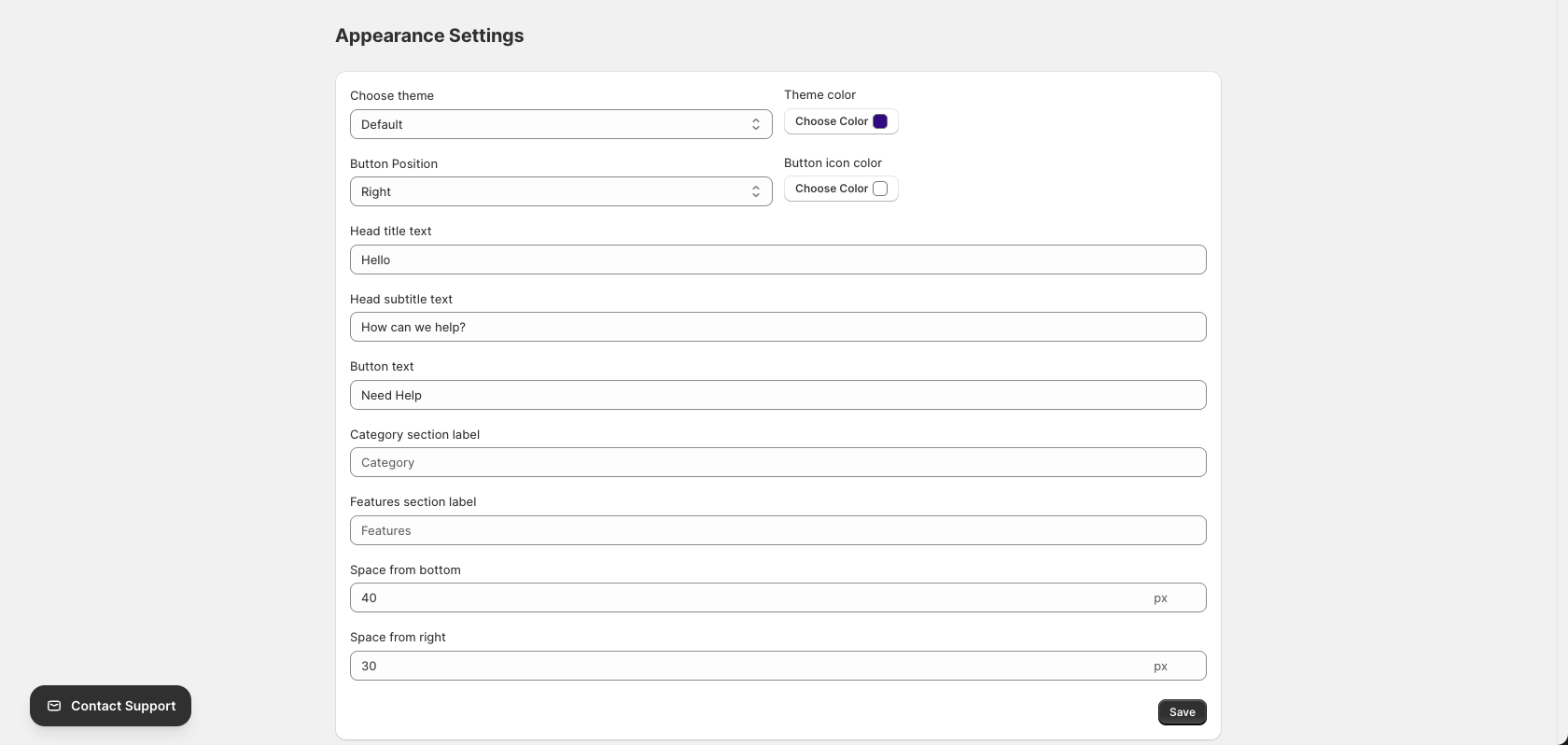
Accessing Settings
To open the Appearance Settings page:
- Go to the HelpMate app in your Shopify admin
- Click Settings in the left sidebar navigation
Theme Settings
Choose Theme
Select the overall theme style for your help widget:

| Theme | Description |
|---|---|
| Default | Light theme with white/light gray backgrounds |
| Default Dark | Dark theme with dark backgrounds for contrast |
Tip: Choose a theme that complements your store’s design. Use the dark theme if your store has a darker color scheme.
Theme Color
Set the primary accent color for your help widget:

- Click the Choose Color button next to “Theme color”
- Select a color from the picker or enter a hex code
- This color will be used for buttons, links, and accent elements
Tip: Use your brand’s primary color for a consistent look across your store.
Button Customization
Button Position
Choose where the help button appears on your storefront:

| Position | Description |
|---|---|
| Right | Button appears in the bottom-right corner (default) |
| Left | Button appears in the bottom-left corner |
Button Icon Color
Customize the color of the icon inside the help button:
- Click the Choose Color button next to “Button icon color”
- Select a contrasting color that will be visible against your button background
Button Text
Set the text label for the help button:

Default: “Need Help”
Examples:
- “Need Help”
- “Get Support”
- “Help Center”
- “FAQs”
- “Ask Us”
Tip: Keep button text short (1-3 words) for better appearance on mobile devices.
Text Customization
Head Title Text
Set the main title displayed at the top of the help widget when opened:

Default: “Hello”
Examples:
- “Hello”
- “Hi there!”
- “Welcome”
- “How can we help?”
- Your brand name
Head Subtitle Text
Set the subtitle displayed below the title in the help widget:

Default: “How can we help?”
Examples:
- “How can we help?”
- “Find answers to common questions”
- “Browse our help center”
- “We’re here to assist you”
Category Section Label
Customize the label for the category section in the help widget:

Default: “Category”
This label appears above your list of help categories in the widget.
Examples:
- “Category”
- “Topics”
- “Browse by topic”
- “Help Topics”
Features Section Label
Customize the label for the features section in the help widget:

Default: “Features”
This label appears above categories marked as “Feature” using the Feature toggle.
Examples:
- “Features”
- “Product Features”
- “Highlights”
- “Key Features”
Spacing Options
Space from Bottom
Set the vertical distance of the help button from the bottom of the viewport:

Default: 40px
Increase this value if the button overlaps with other elements on your site (like cookie banners or chat widgets).
Space from Right/Left
Set the horizontal distance of the help button from the side of the viewport:

Default: 30px
Range: 20 – 300px
Note: This setting adjusts the space from the right side if Button Position is “Right”, or from the left side if Button Position is “Left”.
Saving Settings
After making changes, click the Save button to apply your settings:

Your changes will take effect immediately on your storefront.
Preview Your Changes
To see how your settings look on your store:
- Save your settings
- Visit your storefront in a new tab
- Look for the help button in the configured position
- Click the button to open the help widget and verify your text and color settings
Settings Summary
| Setting | Default | Description |
|---|---|---|
| Choose theme | Default | Light or dark theme |
| Theme color | #320a80 | Primary accent color |
| Button Position | Right | Left or right corner |
| Button icon color | #ffffff | Icon color inside button |
| Button text | “Need Help” | Button label text |
| Head title text | “Hello” | Widget title |
| Head subtitle text | “How can we help?” | Widget subtitle |
| Category section label | “Category” | Category list header |
| Features section label | “Features” | Features list header |
| Space from bottom | 40px | Vertical button position |
| Space from right | 30px | Horizontal button position |
Best Practices
- Match your brand – Use your brand colors for theme color and button styling
- Test on mobile – Verify the button doesn’t overlap with mobile navigation
- Keep text readable – Ensure good contrast between text and background colors
- Use clear language – Write titles and labels that customers understand
- Check spacing – Adjust spacing if the button overlaps with other page elements
- Preview changes – Always check your storefront after saving settings